CASE STUDY
Clear Worth Financial Group Brand Identity: Discover your worth with complete & comprehensive Clarity
When I connected with Clear Worth Financial Group I could tell they were a different kind of boutique financial planning firm. They had a roster of clients who trusted their down-to-earth approach to financial planning and were ready to expand. They just needed a little help with a brand name, logo, brand messaging and visual identity that would resonate with their clients.
Name, LOGO & Icon Design
What’s in a name? Well when it comes to naming a financial group a lot! The process to find that perfect combination of words that hadn’t been used before in a large market took effort and creativity. Using a personal name doesn’t work if it is already taken. Naming a company by the region it serves can be limiting. And there are only so many words about finance that haven’t been taken. Clear Worth Financial Group was at the top of our lists of feasible names and made the most sense for the boutique financial planning firm.
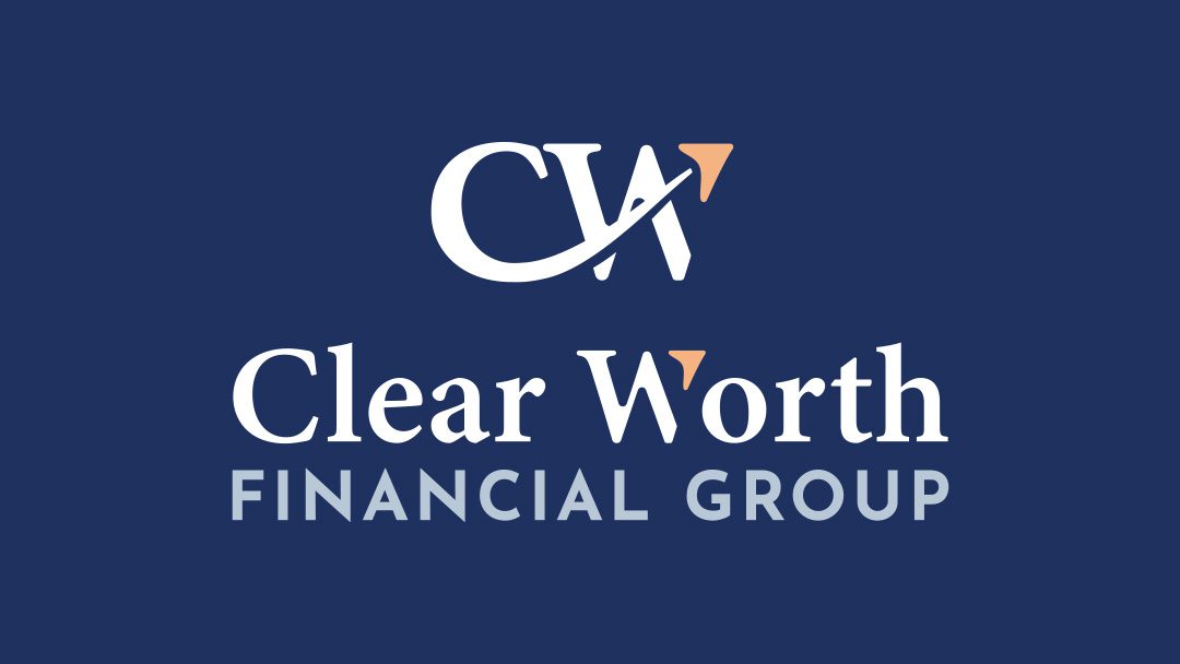
The logo and icon design comes from the name. Focus is placed on the words “Clear Worth,” which point to the promise of clarity when helping clients see their investment potential and worth. The arrow featured within the logo is intentionally pointing in an upward trajectory. And the fonts were selected for their classic and established look and feel. The result is a modern logo for a progressive financial group.

Brand Messaging & Imagery
“Your bucket list is worth it. Let’s build a clear financial plan to get you there.”
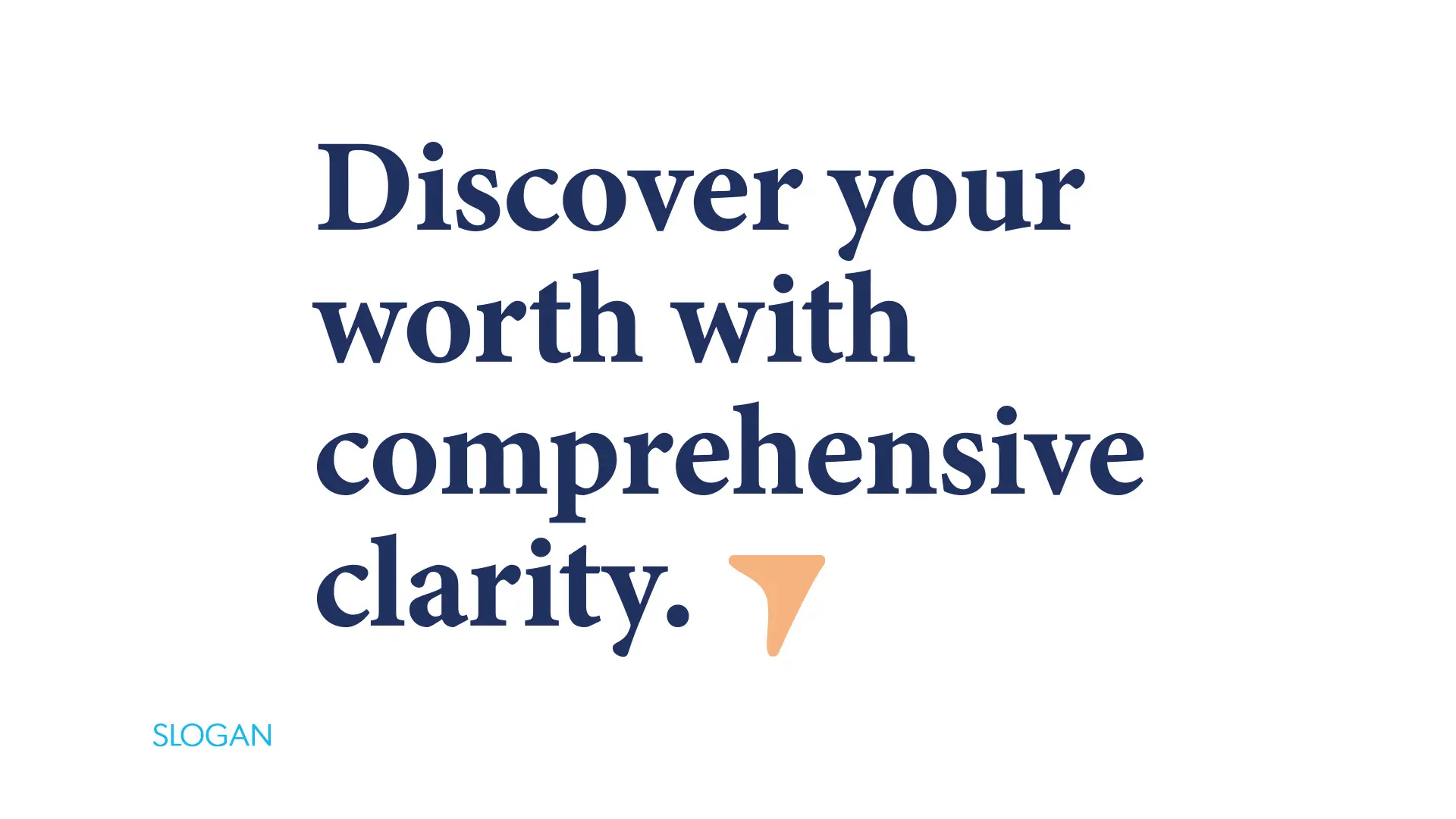
The messaging for Clear Worth Financial Group is aspirational, inspirational and motivational. It is intended to let clients, and prospective clients know how Clear Worth Financial Group differs from other financial security advisor groups. The messaging is friendly, frank, honest, pragmatic and focused on making financial decisions that are about more than just retirement. The primary brand slogan that was developed is “Discover your worth with comprehensive clarity” and all other statements pertain to making financial plans for life moments.
The imagery for Clear Worth Financial Group has the same qualities of the messaging and slogans with an added focus on the BC lifestyle perspective.
Stationery & Design Assets
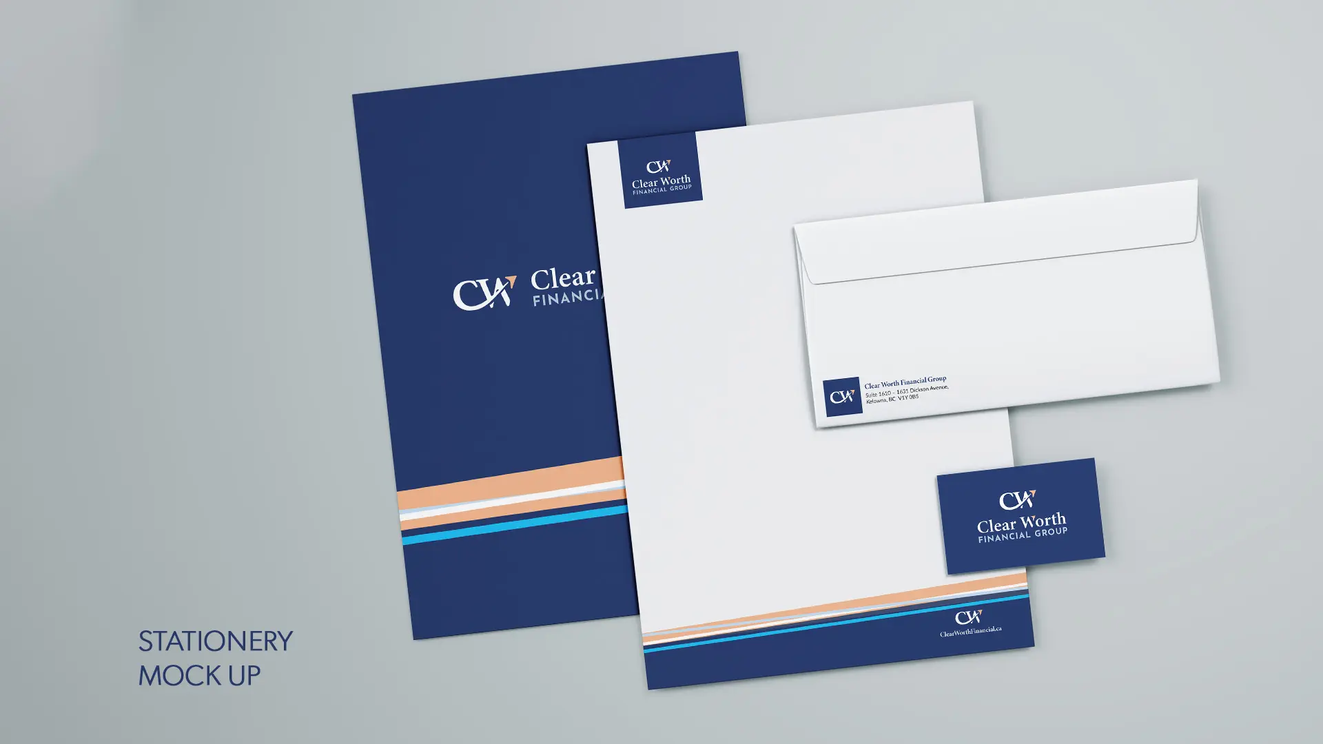
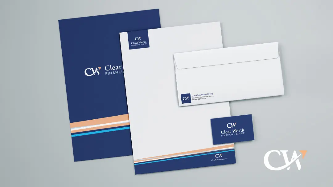
Common design elements and graphics are used in each design asset to create a connection and cohesive brand. All design assets contain brand colours, fonts and a version of the logo. Brand slogans and ad copy are also used to reinforce the brand promise of Clear Worth Financial Group.
∧ CLICK ON THE IMAGES FOR EXAMPLES ∧
BEST VIEWED WITH YOUR PHONE TURNED SIDEWAYS.

THE RESULT
The result is a brand identity that is honest, aspirational and professional, perfectly representing a boutique financial planning and advisory firm. Clear Worth Financial Group has been effectively branded to communicate to their clients and prospective clients.

