CASE STUDY
High-End Floral DESIGNs: Enterprise Flower Studio Logo Refresh
Enterprise Flower Studio provides professional creative floral arrangements that help people express their emotions in a way that makes a lasting impression. Their online presence needed a boost to reflect their brand promise and elevate their visual identity. To accomplish this they required a logo that expressed trust, modern sophistication and elegance.
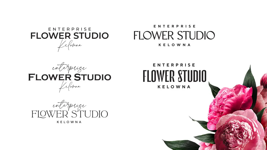
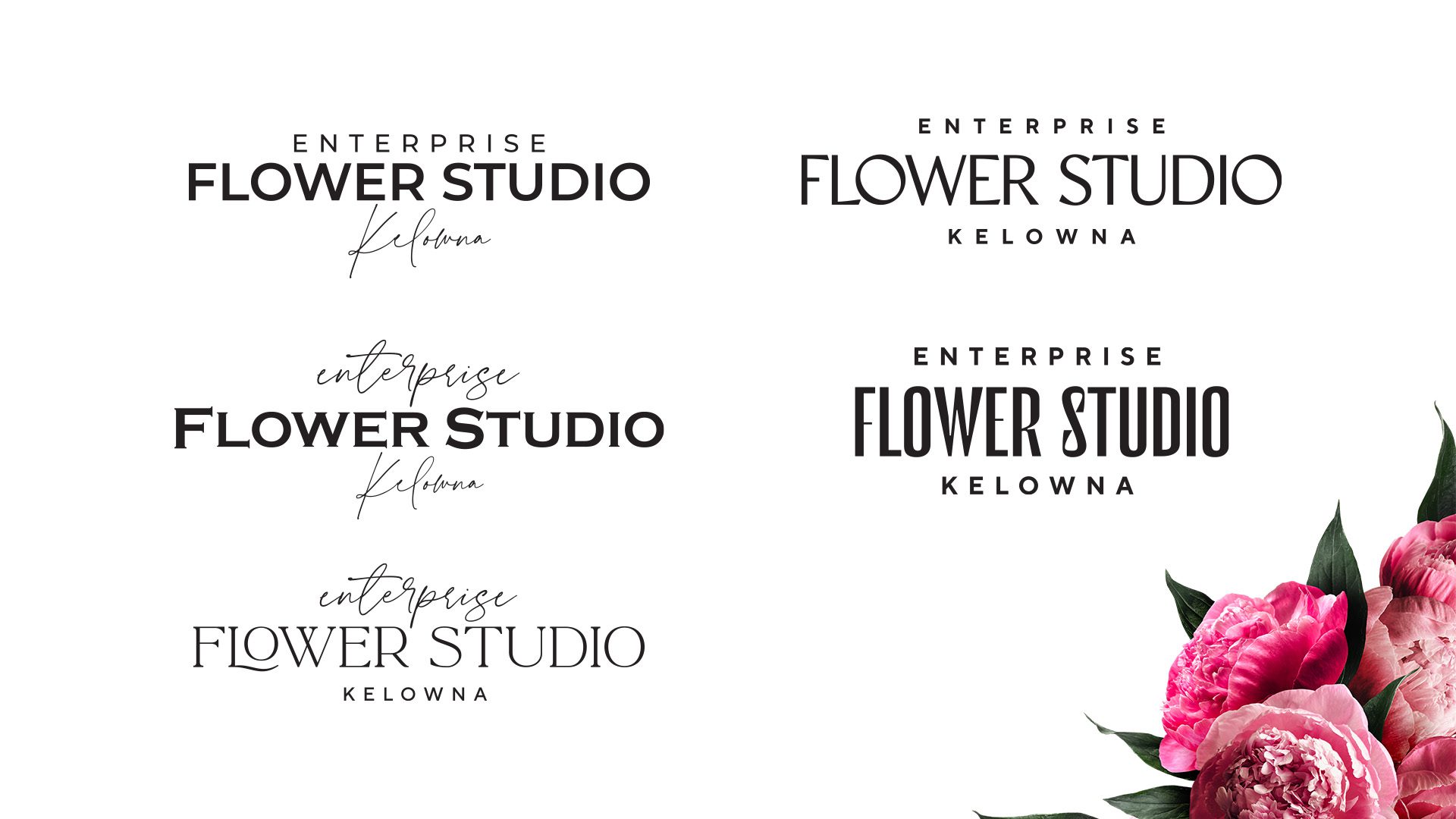
Typography Explorations
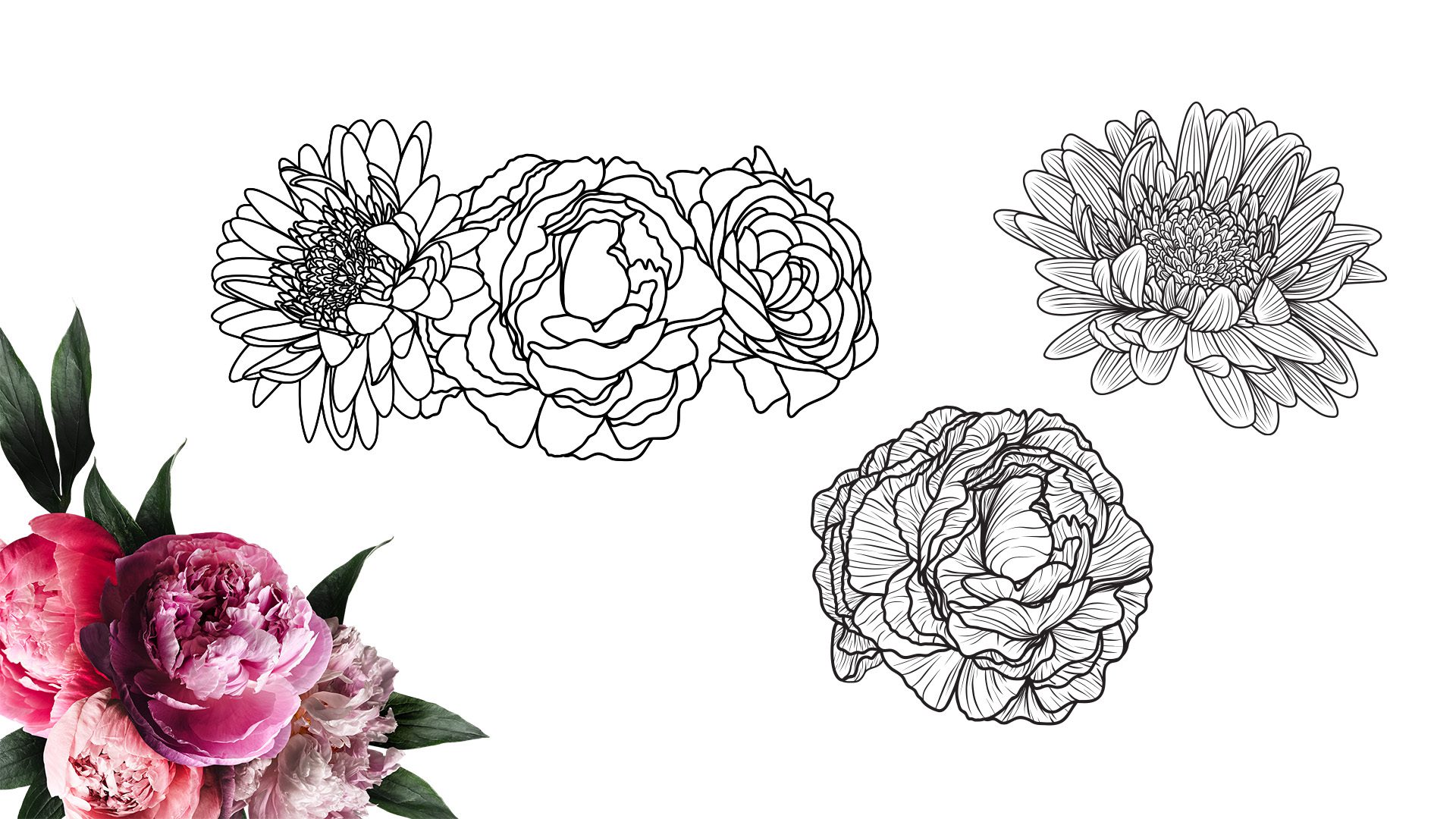
Graphics Explorations
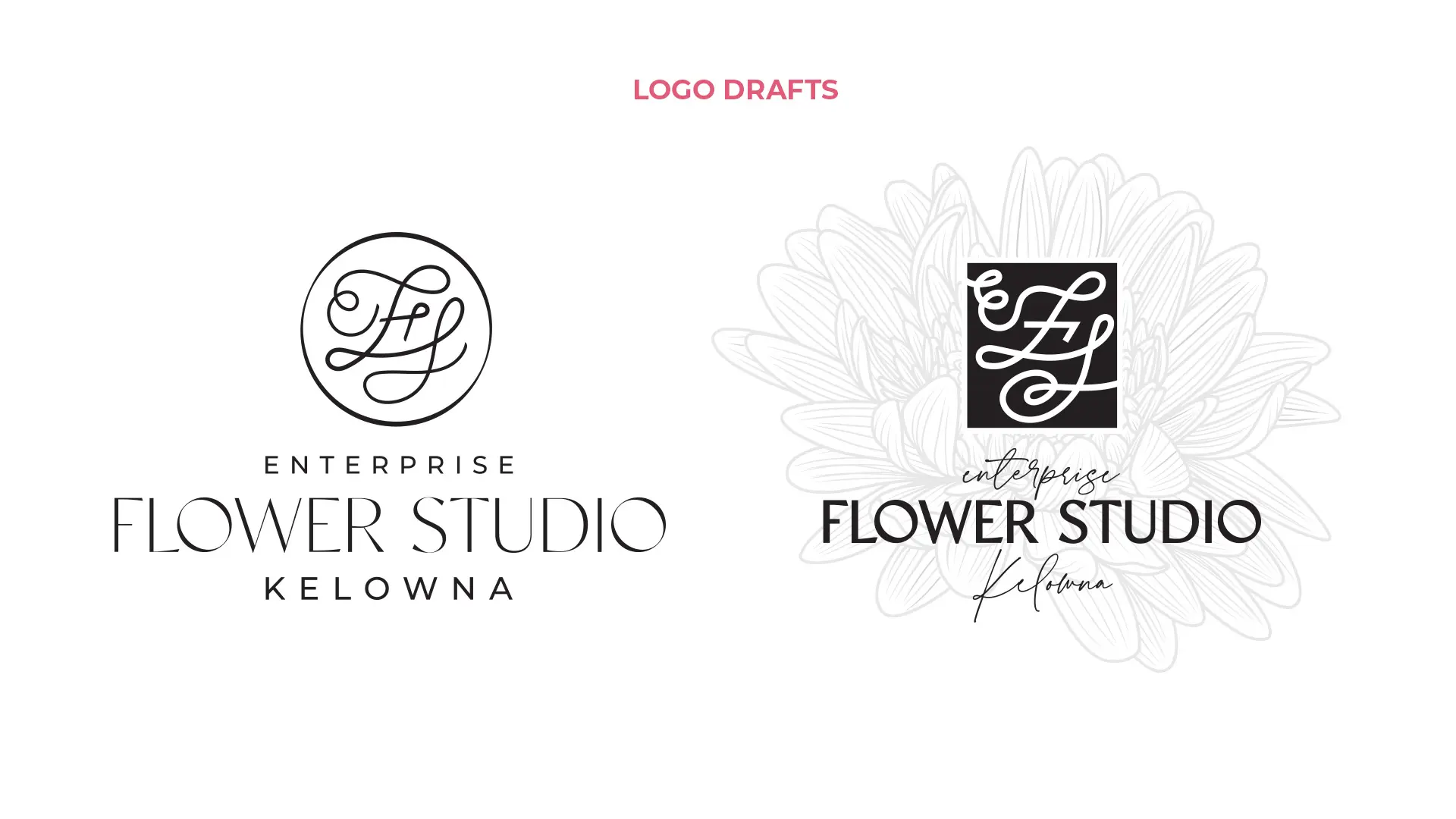
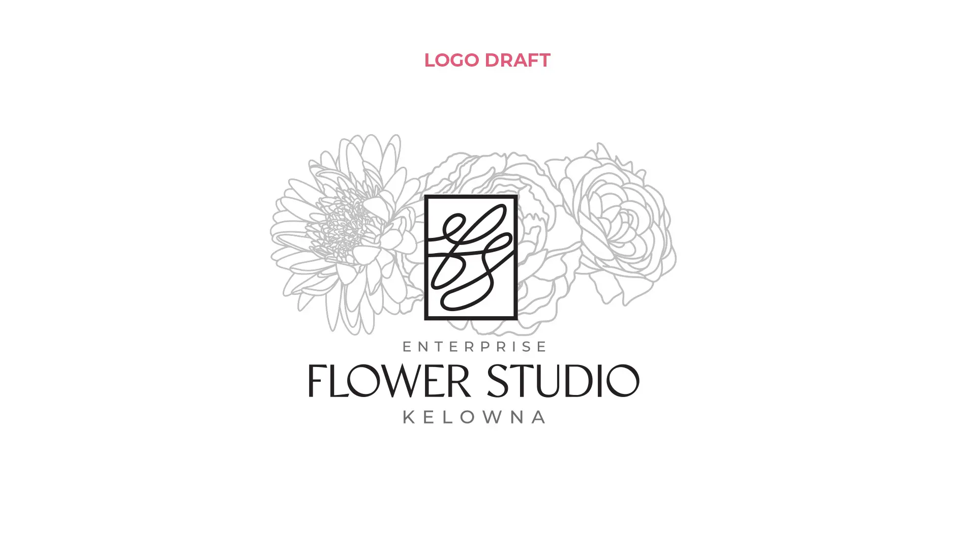
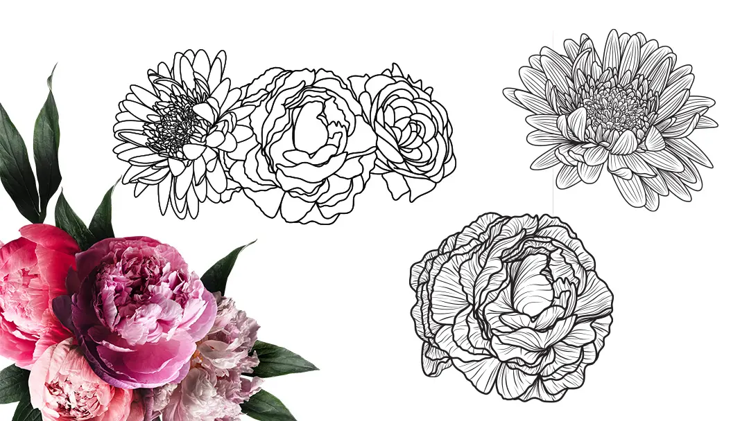
Monogram and pictorial icon options were explored during the design process. Monograms can be a sophisticated touch for well-established luxury brands as such, I wanted to explore this option as a part of the new logo and stand-alone trademark.
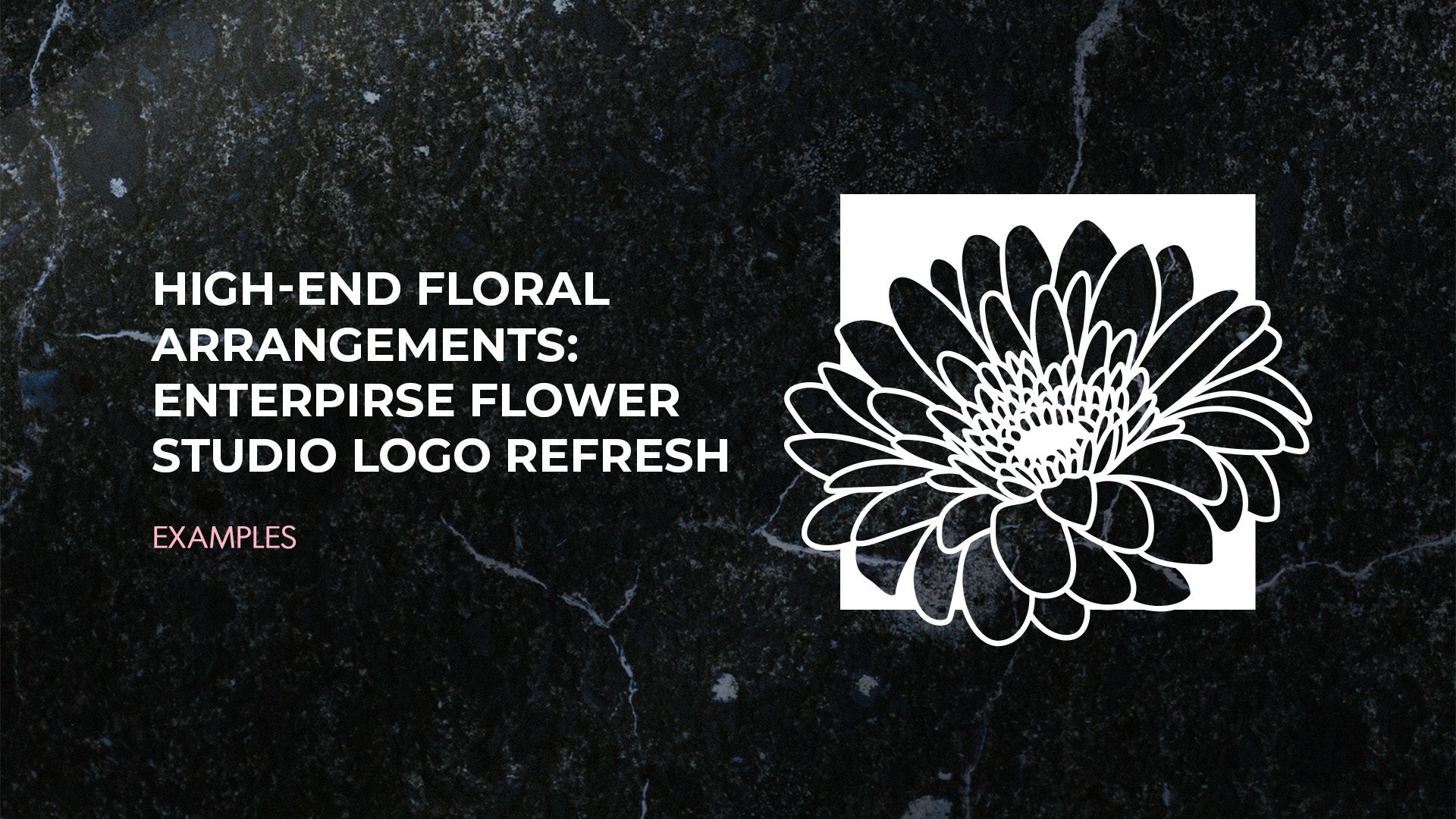
For the final logo, a floral illustration was the best option for uniqueness and sophistication. Peonies and other delicate full florals were explored for their luxurious qualities; however, daisies were used in the old logo, so a more detailed line drawing of a Gerbera daisy suited the new logo perfectly.
Logo Refresh
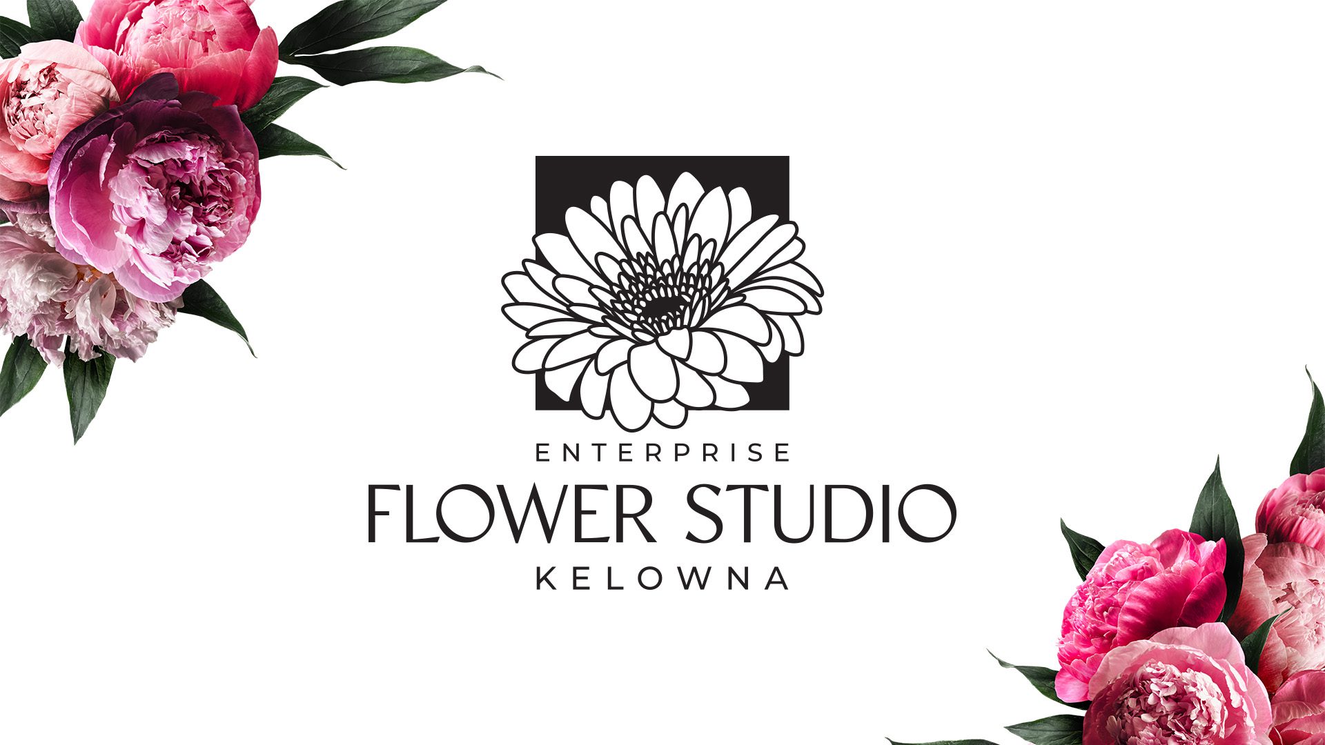
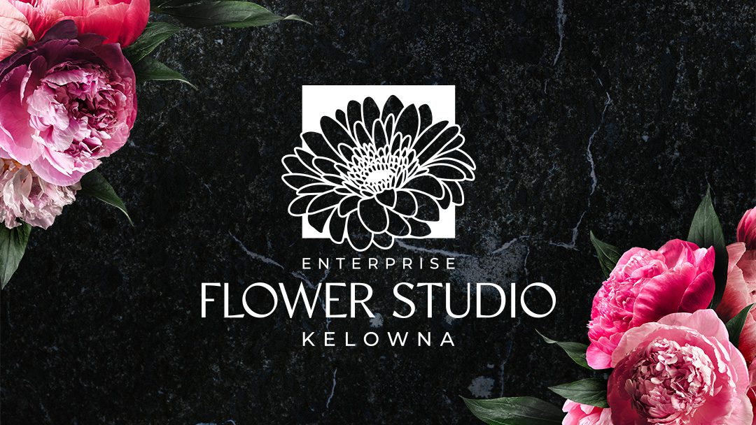
The resulting logo nods to the original logo with an updated stylized version of the daisy icon paired with a beautiful modern font that has classic features, medium weight and contrast. Variations of the logo allowed for it to be used on the website, uniforms, business cards, signage, and much more. The refreshed logo for Enterprise Flower Studio represents the sophistication and class of a high-performing professional florist.
∧ CLICK ON THE IMAGES FOR EXAMPLES ∧
BEST VIEWED WITH YOUR PHONE TURNED SIDEWAYS.

THE RESULT
The result is a luxurious logo refresh for Enterprise Flower Studio that manages to capitalize on their brand equity while presenting a new high-end direction for the business.

