CASE STUDY
Bountiful Lake Country: Farm Gate Trail LOGO & Visual IDENTITY
Farm Gate Trail Lake Country, BC is an enticing, vibrant and uncomplicated local farm gate program that invites locals and tourists to discover and explore the farm-fresh treasures from this unique part of the Okanagan Valley. The unique bounty that is grown here changes with the seasons and provides a variety of great things from flowers to garlic and cherries to farm-fresh eggs; the list is extensive, and there is no lack of surprises.
The design solution for such a vibrant, eclectic and industrious farm gate program needed to be something great!
LOGO Design
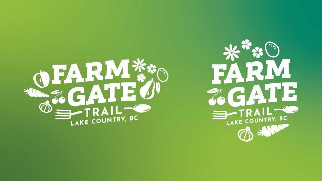
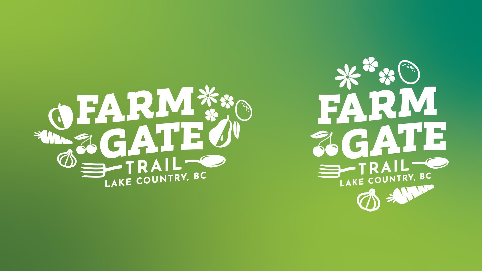
The primary function of the Farm Gate Trail logo was to have a good presence on signage so that locals and tourists could find the participating farms easily when exploring Lake Country’s agricultural land just off the beaten path. The solution is impactful and direct enough to draw attention from passersby in their vehicles, identifiable enough to warrant a stop, and memorable enough to get people talking. While the logo is one component of the brand, it is the first thing that is seen, and it helps to identify the program.
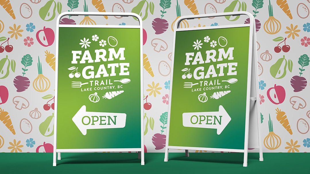
Signage & Billboards
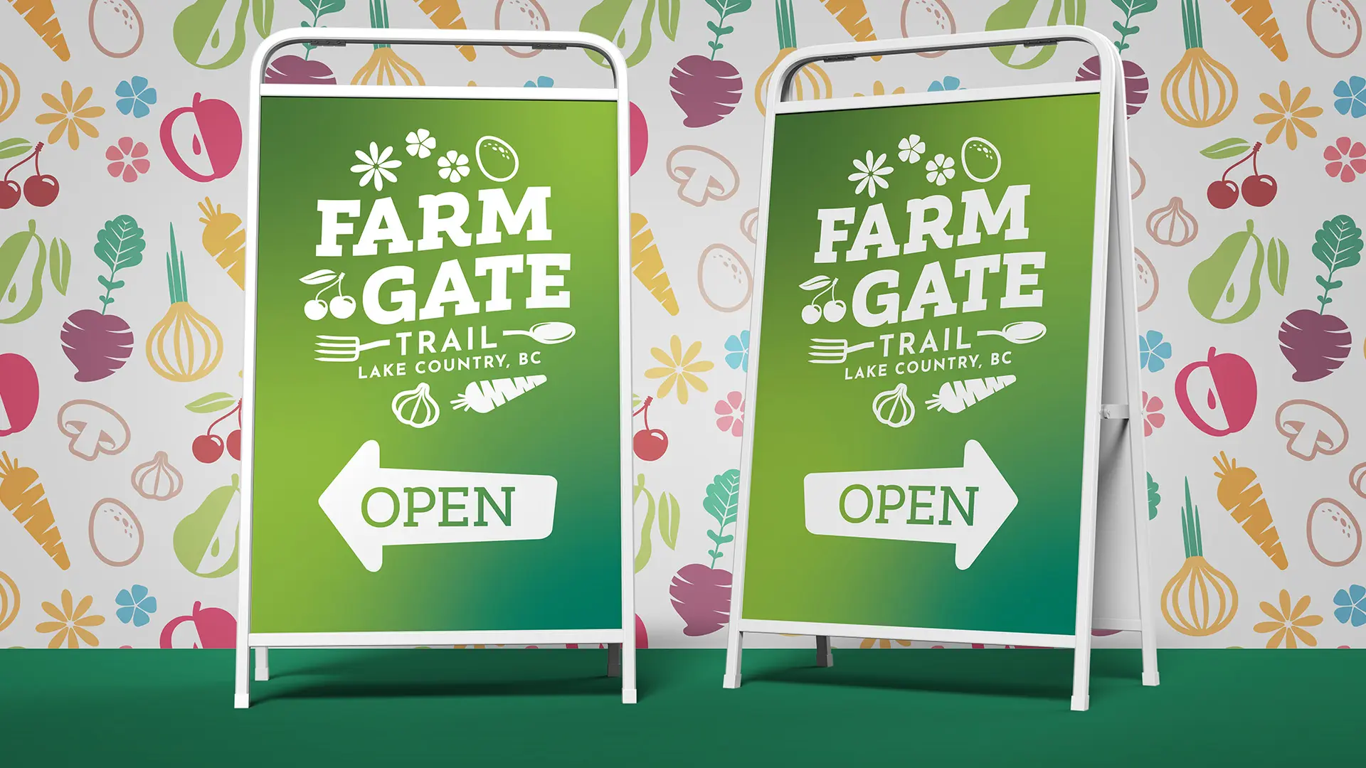
Wayfinding is an important part of the Farm Gate Trail program. Billboards and sandwich boards were designed for maximum impact and memorability in a short amount of time. To accomplish this it was important to keep the imagery simple and use the appropriate version of the logo to increase legibility from a distance. All large format designs were had very little copy and one hero image or graphic.
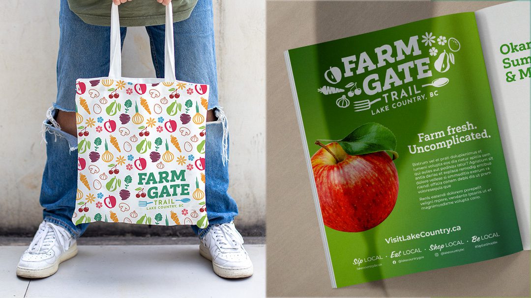
Patterns, Swag & Ads
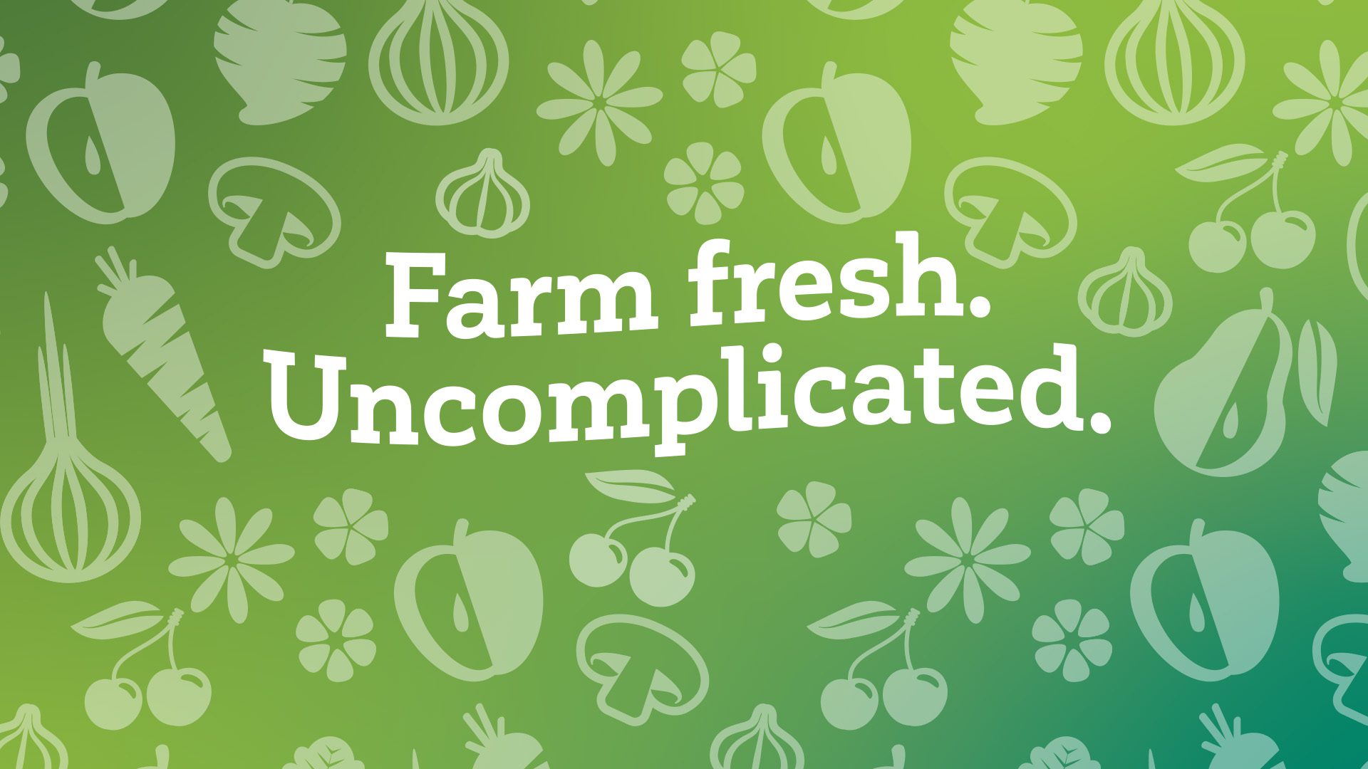
A pattern of stylized food graphics was designed from the illustrations used in the logo plus a few extras. This pattern was then placed into swag mockups, backgrounds, social media posts and ads.
The initial full-page and half-page ads were designed to look like the billboards and sandwich boards, making the connection between all parts of the brand.
∧ CLICK ON THE IMAGES FOR EXAMPLES ∧

THE RESULT
The result is something eye-catching, vibrant, and professional, in each designed piece – from logo to brochure, and from Facebook page to website. PLAN Okanagan was given a new look for their platform of care that I hope helps them garner more support and fanfare.

