CASE STUDY
Bold Design for Word Reclamation: Branding a 2SLGBTQIA+ Event Series with a Polarizing Term
When Fruitcake was in development, the name still held controversy. Would the name attract the right audience, or would it have the opposite effect? Could a 2SLGBTQIA+ party event series successfully exist in a city that didn’t have dedicated 2SLGBTQIA+ hangouts (at the time)? What became evident was that a design with the right amount of confidence, unabashed truthfulness and vision could communicate the concept and help make reclaiming the word a cakewalk.
LOGO DESIGN
Rebellious Unicorns Production Company Inc. approached me with the task of developing a logo and creative concept to set the standard for Fruitcake’s visual voice. Fruitcake needed to look like a colourful 2SLGBTQIA+ friendly “big city” club night without playing into a stereotype to take power away from the word being used in a negative context and keep from alienating the people it was trying to attract. Of course, not everyone would be a fan of the concept, but for those who were, this was the night to look forward to letting your freak flag fly.
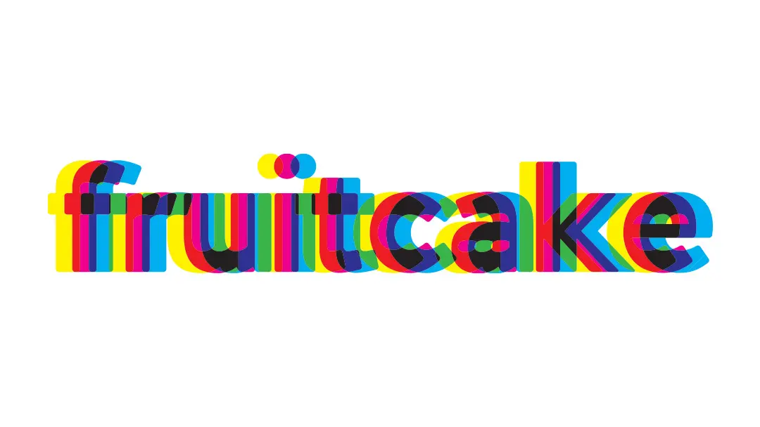
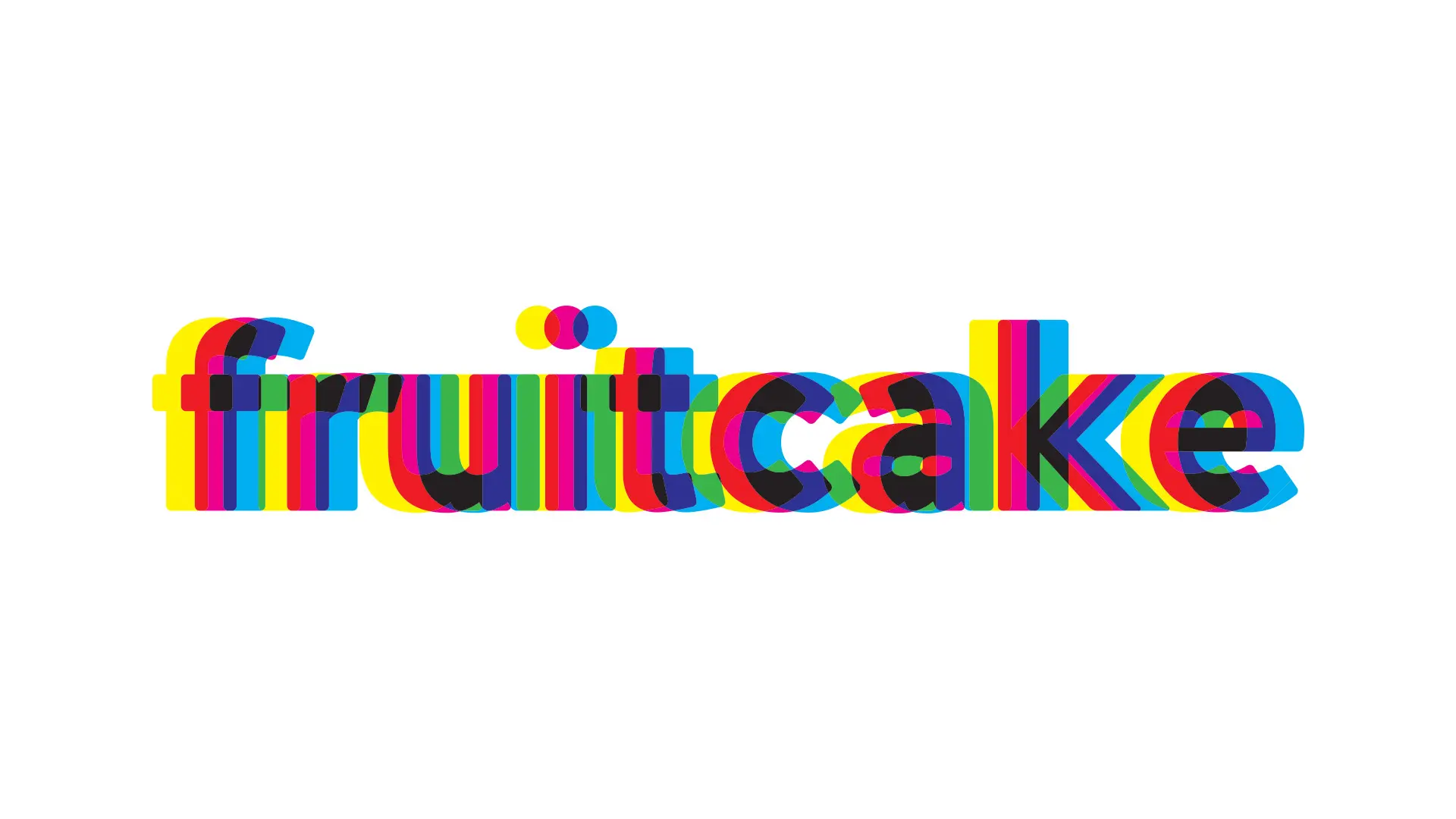
The design needed implied motion, colour (lots of it), and digital and print applications. After much research and experimentation, a creative concept was developed that drew design inspiration from Swiss modernism. Evan’s flair for dramatic photography and working with models in interesting environments gave each photo the right amount of contrast and detail to match my proposed vision of Swiss modernism for a new era. It proved to be a perfect collaboration in delivering the right amount of subtext without being overly complicated.
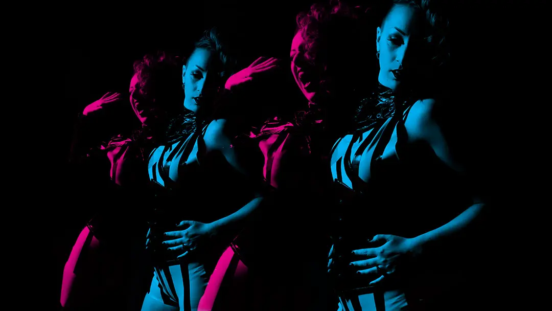
Photography & Visual Treatment
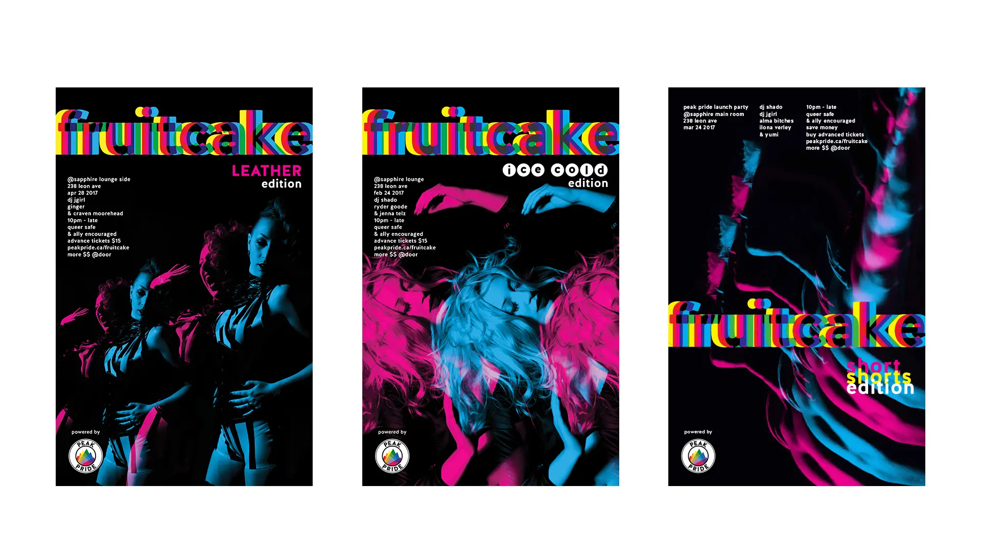
Fruitcake visuals were designed to stand out on public bulletins amongst other show and event posters, effectively boosting awareness of the event in public spaces and celebrating the local 2SLGBTQIA+ community and its allies.
Because the wordmark logo evokes the dizzying motion and colourful lights of a dance floor at a nightclub. The photographic style and visual treatments needed to match that same energy. Collaborating with Evan Eisenstadt to produce high-contrast photographs of people in manneristic poses helped to capture the nightclub party experience without the club. Layering those images in the same manner as the words in the logo made a strong visual connection.
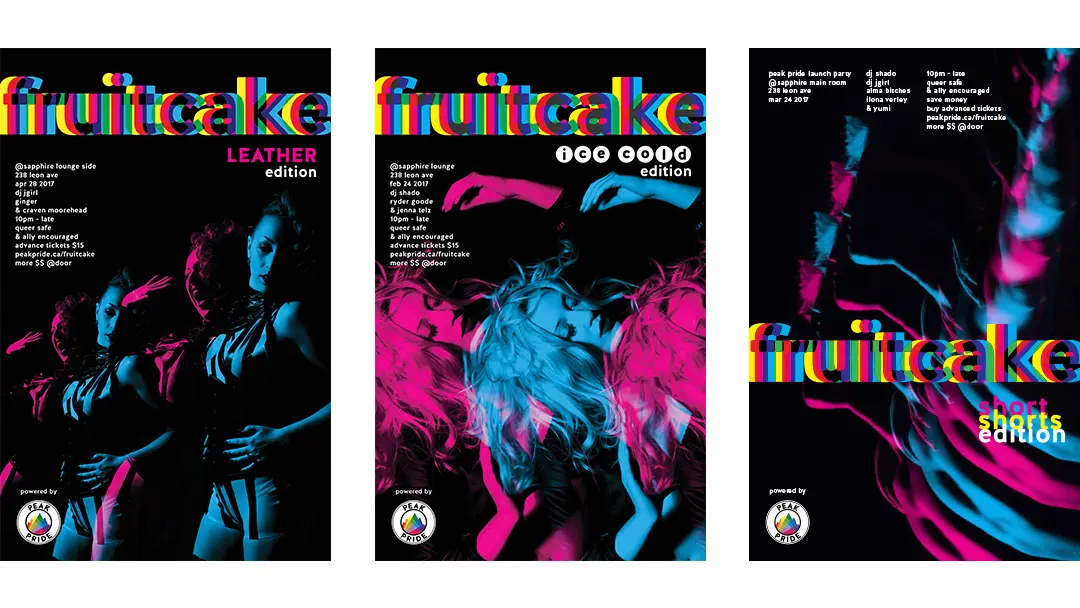
SWISS POSTER DESIGN MEETS POP ART CONCEPT
The objectives of the project were three-fold. First, create buzz and recognition for a new 2SLGBTQIA+ club night using creative visuals and strategic identity design. Second, find ways of making the event look like a premier party night for a budget-conscious client. Third, capture a viewer’s attention and present information memorably through a unique visual voice.
Typography and composition followed the clean legibility of Swiss modernism, featuring a clean, legible sans-serif font laid out in a grid system paired with bold imagery to convey information clearly to the viewer. The overall outcome was a set of cohesive visuals that expressed the energy of 2SLGBTQIA+ party culture in an impactful and intriguing way.
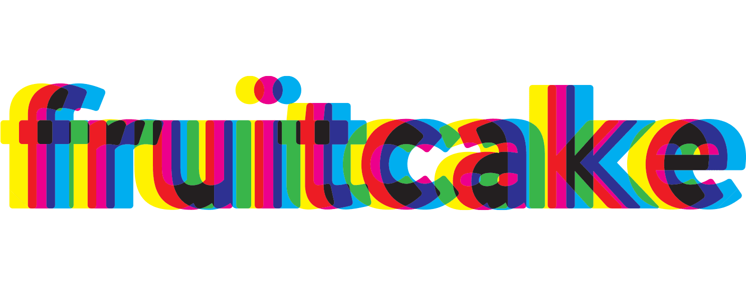
THE RESULT
The result is a logo design and creative concept that is eye-catching, vibrant, and full of energy. The wordmark and visuals have managed to attract the right crowd and bring the community together in celebration.

