Case Study
Your inclusive Journey, Mapped: Our City Too App logo and brand identity design
Our City Too logo design is emphasizes the friendly and caring nature of an app developed to celebrates and cater to marginalized communities by giving them the power to map out their safe journeys in urban areas through trustworthy, community-driven interactive maps. Creating this logo and brand identity was a fun exercise in matching design with intention.
LOGO
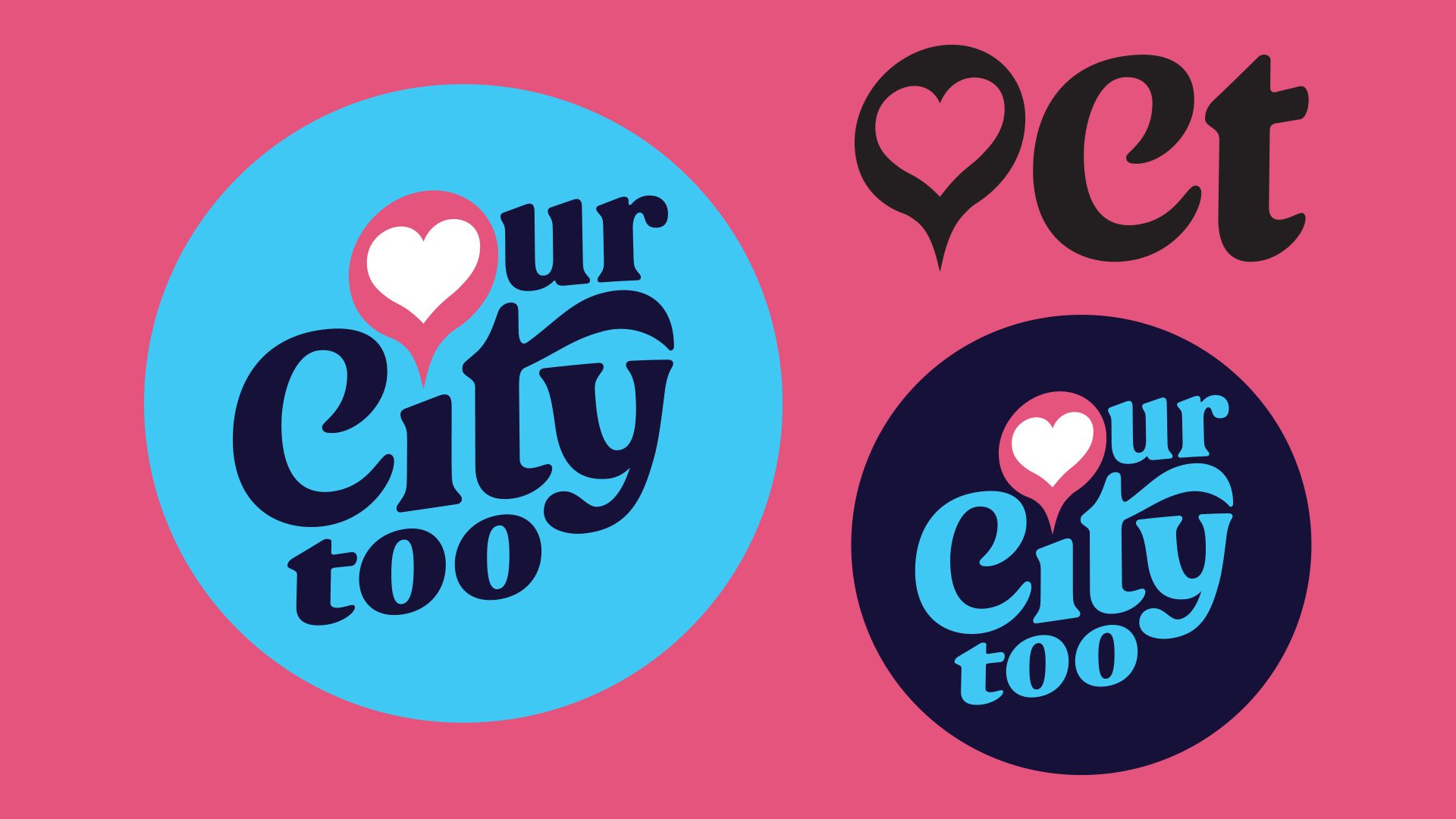
The logo was designed to be friendly and caring with a heart map pin as an “O” and arguably one of the most friendly and approachable typefaces for the wordmark–Peachi. The lockup fits snuggly into a circle which makes it easy to fit in a social media profile image. The logo is also easily translatable to black and white or single colour for various applications.
The logo was designed to work well for an app and apparel. It is a design that has been designed with responsiveness in mind as well with abridged versions. Along with the identity system, the logo represents a celebration of the city we thrive in with personal and community-driven insights populating an interactive map.
Personalization & Community Markers
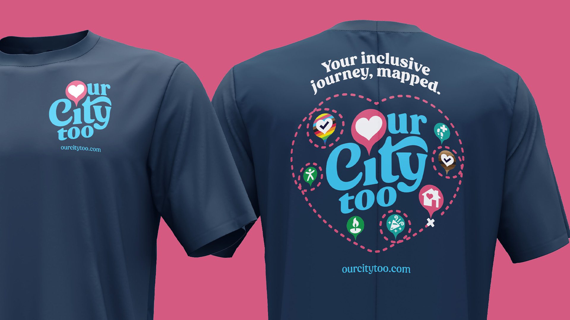
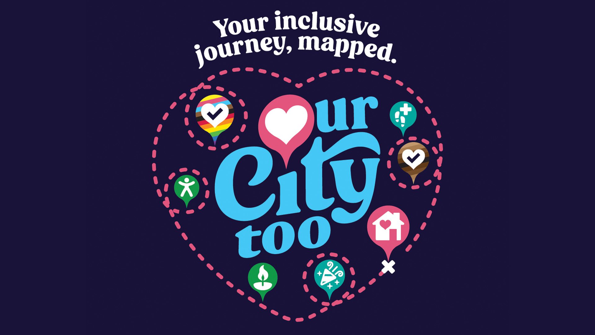
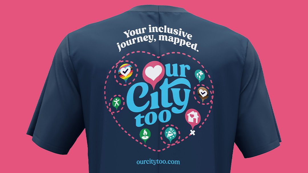
The illustrations designed, created an easy to recognize language for Our City Too users to follow and use to add personalization to their own map of experiences within the city. The t-shirt design showcases the potential of the app to map out a diverse and inclusive journey. The creator of the app has poured a lot of heart into this project which is why hearts abound in the designs and icons.
A Logo for Businesses Too
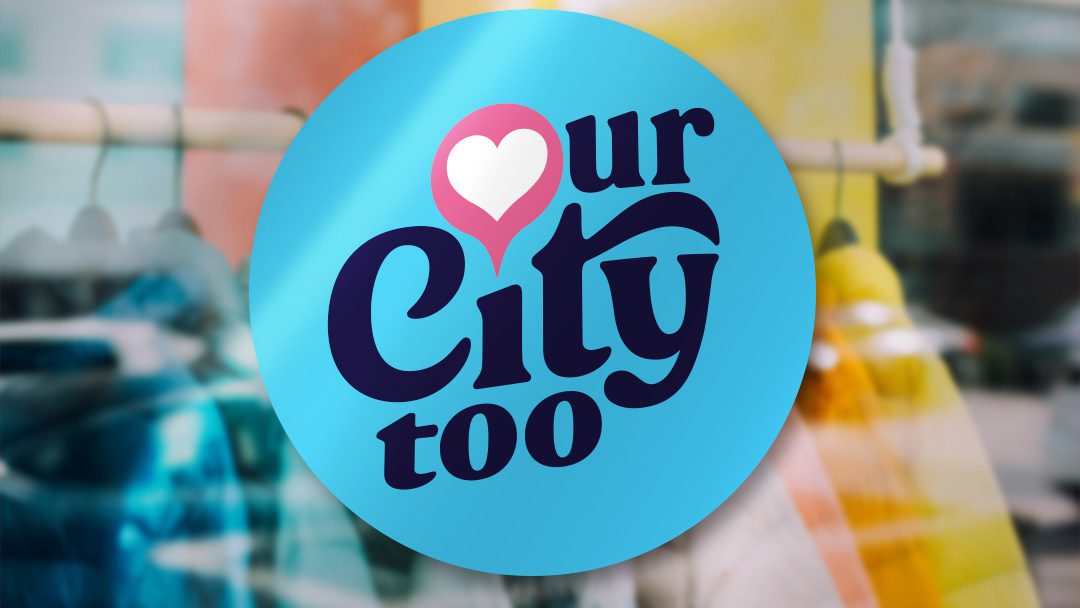
One of the key pieces of this logo and brand identity design is the creation of a sticker that can be applied to the window of a participating business. Businesses can apply and subscribe to be declared as a safe space to the marginalized community they serve and receive a kit that allows them to express their support for the Our City Too community.
∧ CLICK ON THE IMAGES FOR EXAMPLES ∧
BEST VIEWED WITH YOUR PHONE TURNED SIDEWAYS.

THE RESULT
The result is a logo and brand identity design that is friendly, approachable and caring just like the app it represents.

