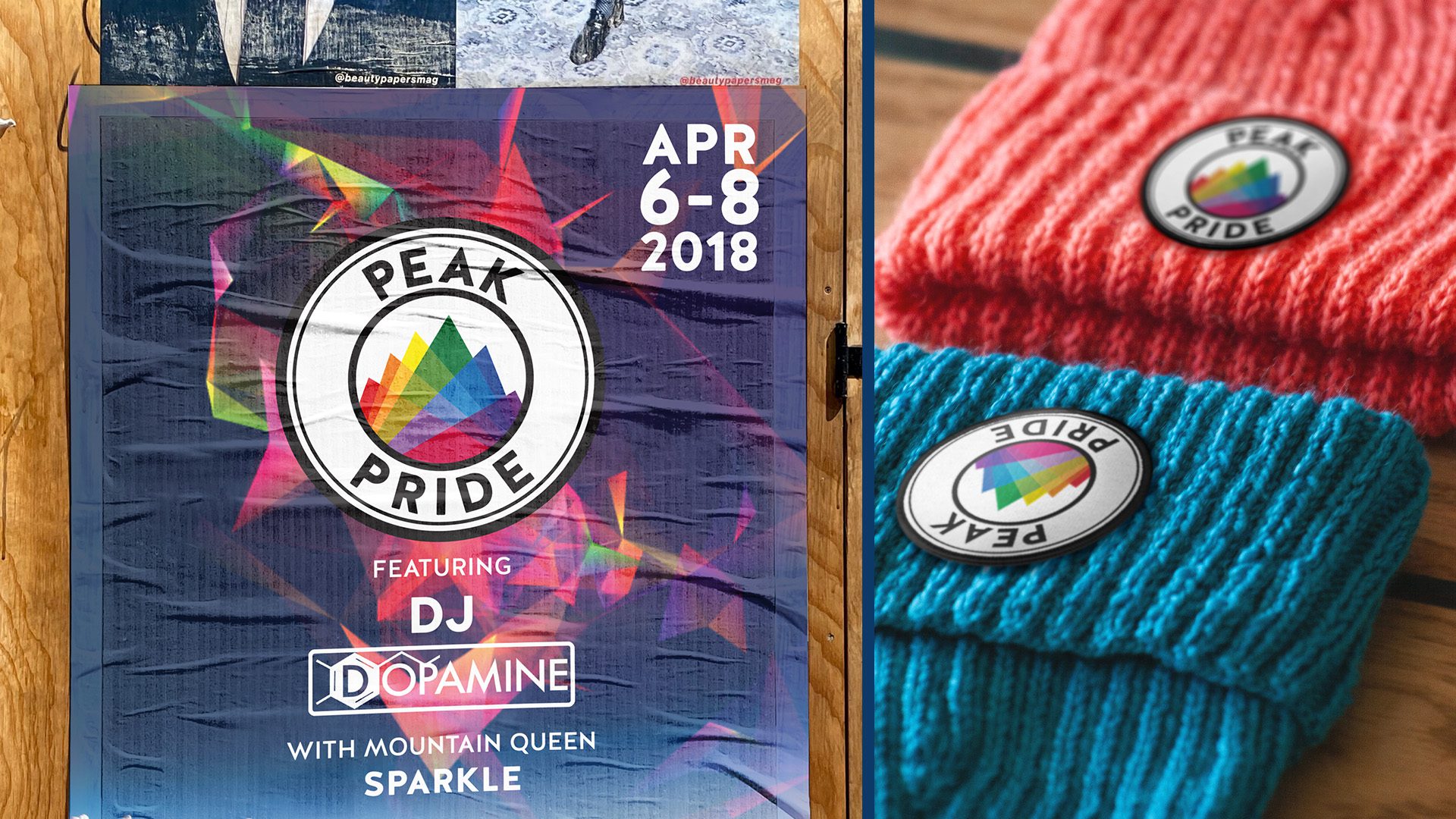
CASE STUDY
PRIDE TAKES TO THE SLOPES: A BRAND IDENTITY CASE STUDY
When Peak Pride approached me for help, they had a great multi-day ski 2SLGBTQIA+ event in the works with one of BC’s top ski resorts. Talent was in the process of being hired, contracts were being negotiated, partnerships were being formed, URLs were being purchased, and the name had been confirmed – Peak Pride was happening!
The excitement was palpable in every discussion; however, this passion project needed a visual voice to support the event promises before launching to public fanfare. The challenge was to deliver a simple design system that would attract the right audience to Peak Pride events and be easy to use moving forward.
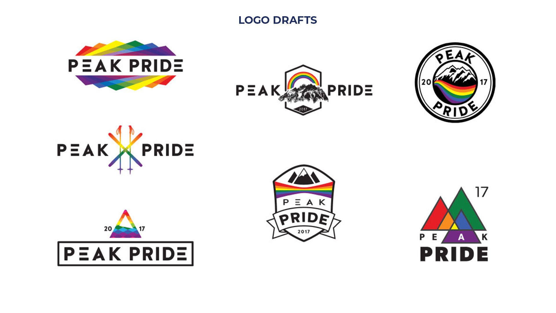
LOGO DESIGN DRAFTS
I was tasked with creating a recognizable brand for a new Pride winter event with the potential to expand to multiple ski resorts in BC and across North America. Peak Pride was eager to make an impact in a niche market with very few established competitors.
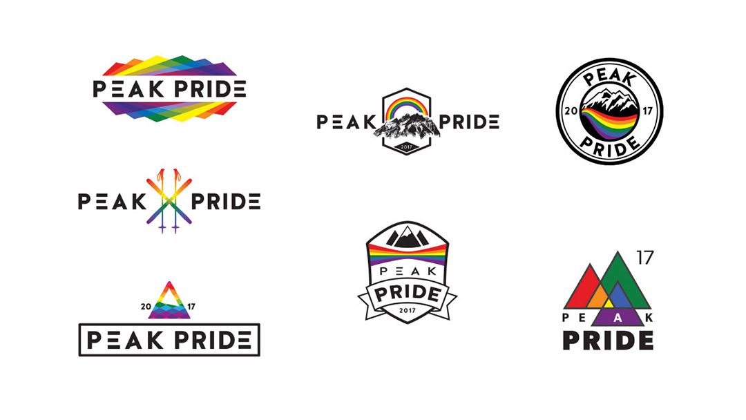
All they needed were the design assets and tools necessary to approach sponsors, vendors, and ski resorts to encourage them to partner in the event and garner the attention of attendees. Several logo solutions were explored.
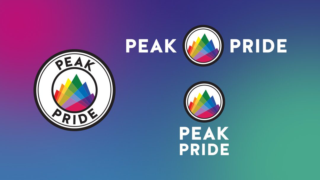
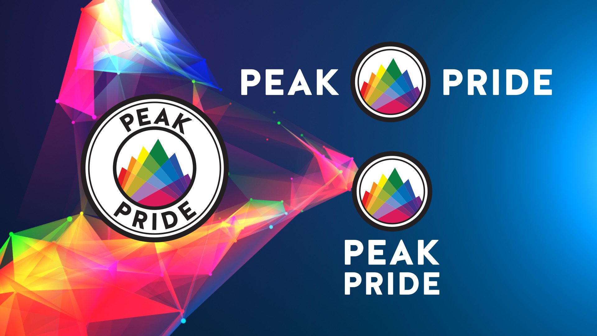
Final Logo
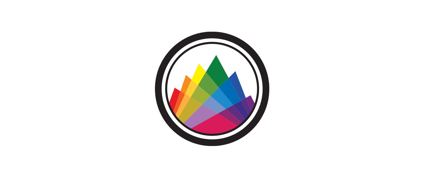
The final Peak Pride logo is a modern logo that represents the diversity, inclusivity and community of a 2SLGBTQ2IA+ winter mountaintop event and is versatile enough to be used in various media. The design solution incorporated the colours of the rainbow into mountain peaks within a badge-style logo which can be easily applied to merchandise and promotional pieces.
It also comes in single colours versions for times when production of many colours is prohibited.
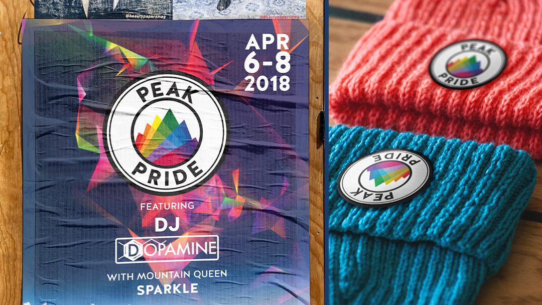
MockUps & Design elements
Having a comprehensive design system helps in providing direction to staff and partners when developing branded materials for Peak Pride.
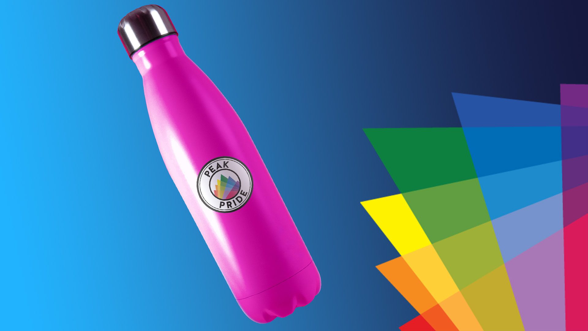
I designed visual assets as examples of how to work with the new logo and design system when designing event-specific pieces. The colour palette, fonts and graphic peaks elements provide a starting point for further design explorations. Mockups provide ideas for retail items, giveaways and staff uniforms for the 2SLGBTQIA+ winter event.
THE RESULT
The client was excited to start using their logo absolutely everywhere. Its modern simplicity and multicoloured peaks garnered the attention of sponsors and attendees alike. The design of the sponsorship package added to the confidence and legitimacy of the Peak Pride presentation to potential investors. In fact, the public reaction was so successful and immediate that more sponsors jumped on board to participate after seeing the branding in context.

