CASE STUDY
Brightly Imaginative Great Food: QB Gelato & Bakery Brand Refresh
QB Gelato & Café had great fanfare as the best gelato makers in Kelowna, but they are so much more than that, which is why they requested help in a brand refresh. Creating imaginative food using quality ingredients from scratch is such a big part of the QB experience it needed a refresh to make things more clear for their customers and new visitors alike. Making it clear that QB was about more than just gelato was a big task with many steps.
New Design Systems
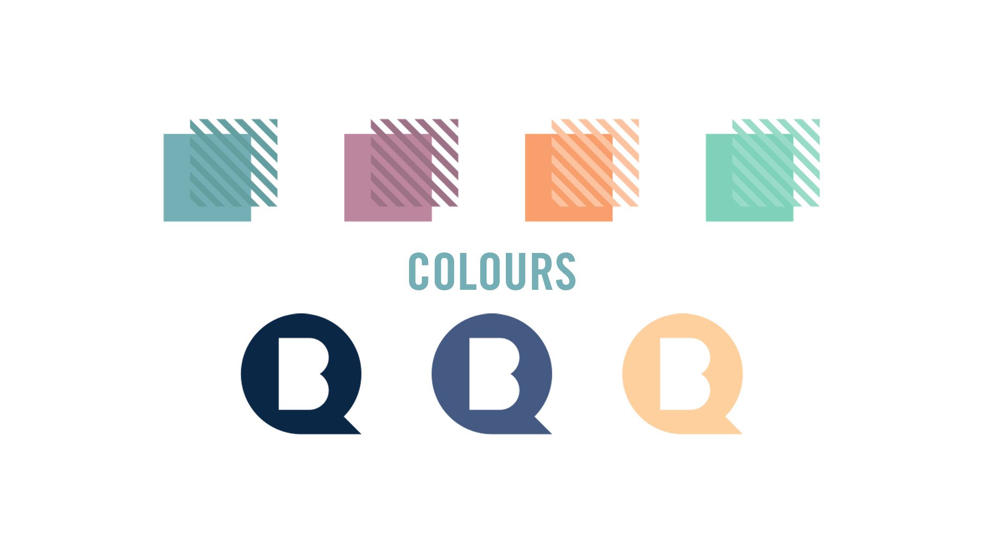
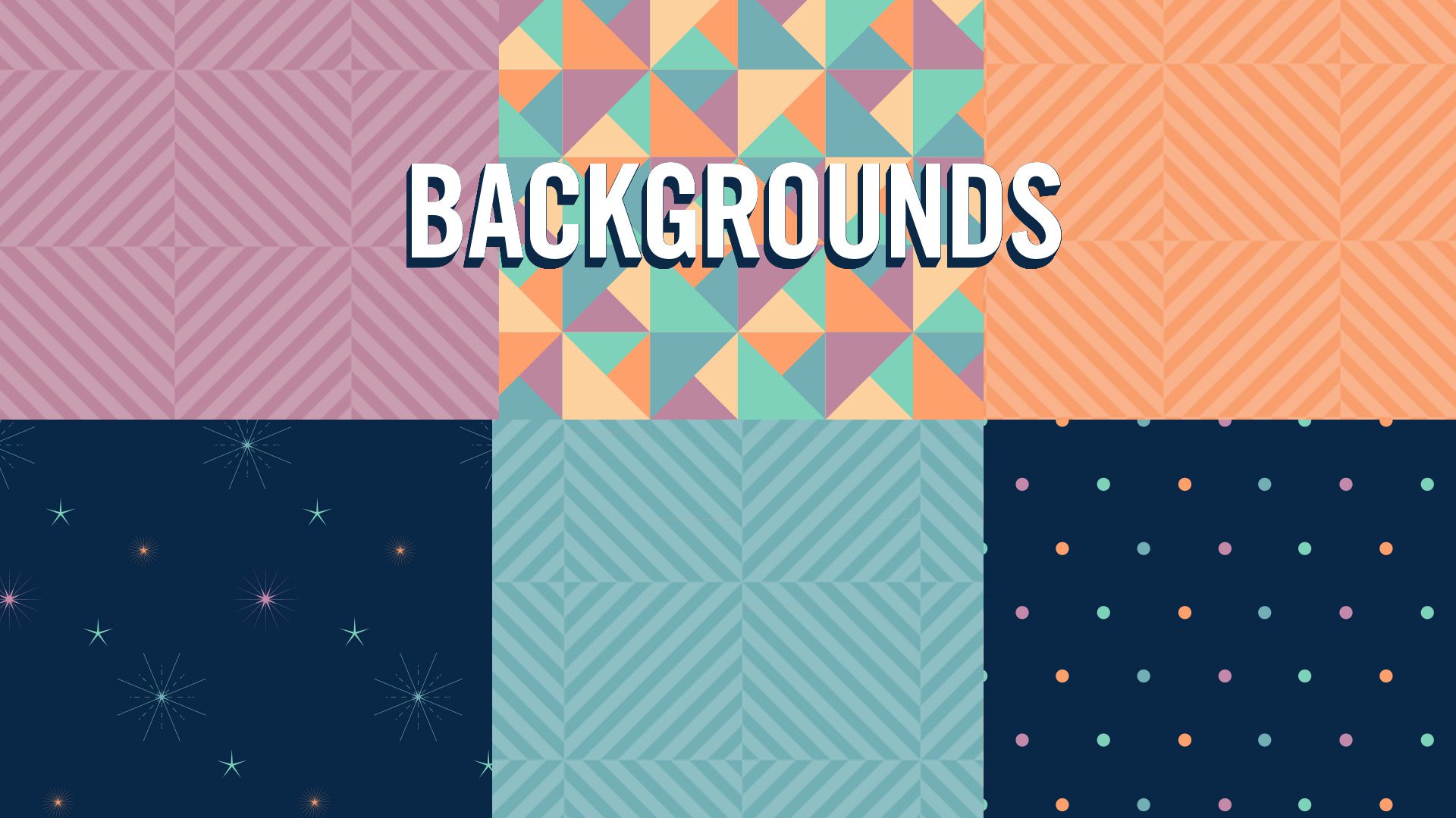
The first part of refreshing the brand was conducting a visual audit of old brand assets to look for inconsistencies and places for improvement. The colours that were already introduced and fonts that were established provided a solid foundation for further development. Using these elements effectively in creating a new design system made things easier for customers to visually make the connection between kinds of treats and baked goods.
Blue for gelato, mauve for sorbetto, mint for desserts, orange for baked goods and white with mauve spots for cool treats. Fonts were sorted into usage categories for information, celebration and product names.
Labels & Packaging
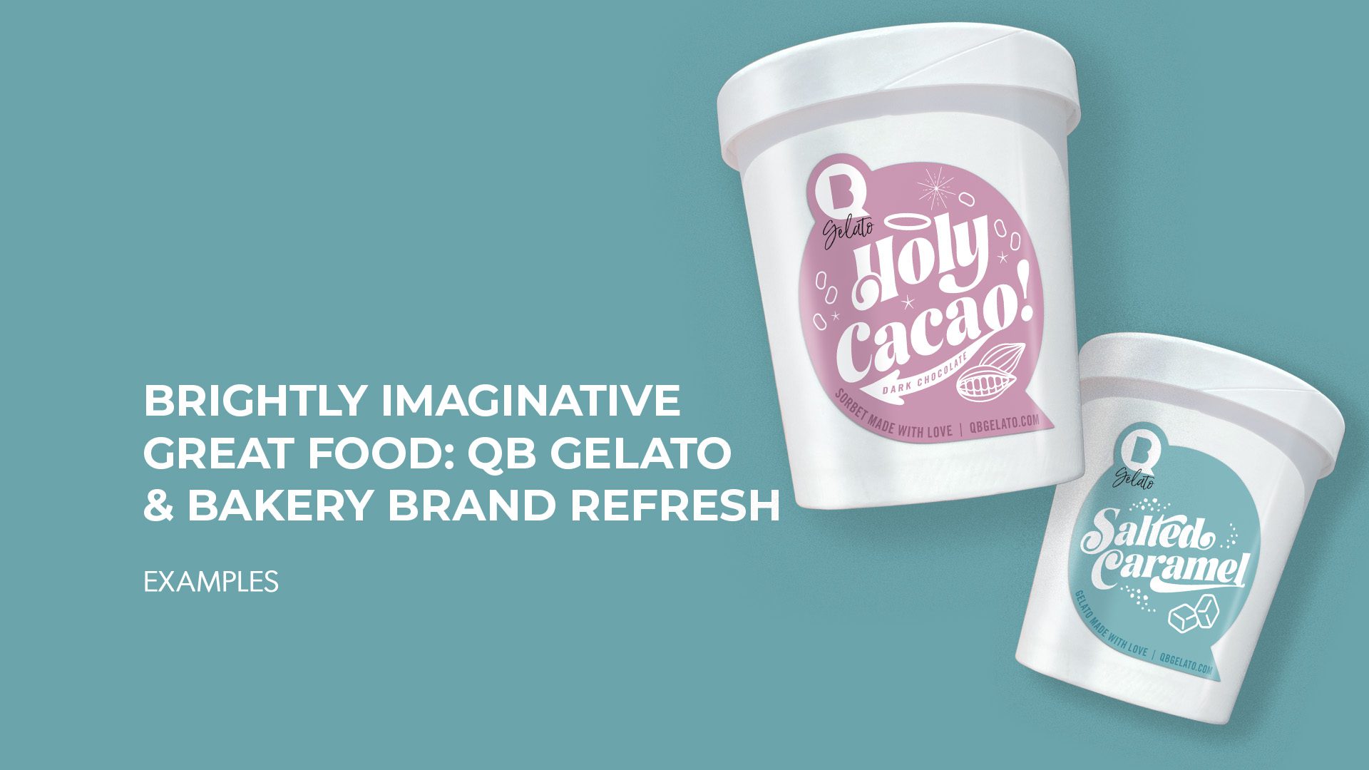
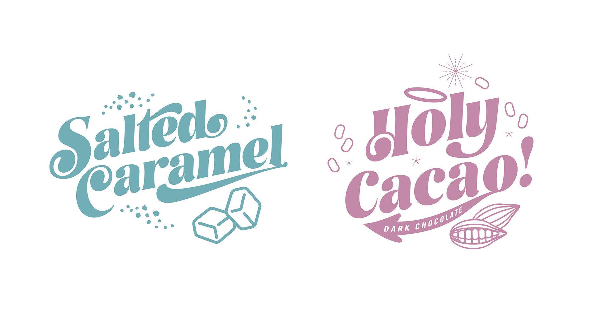
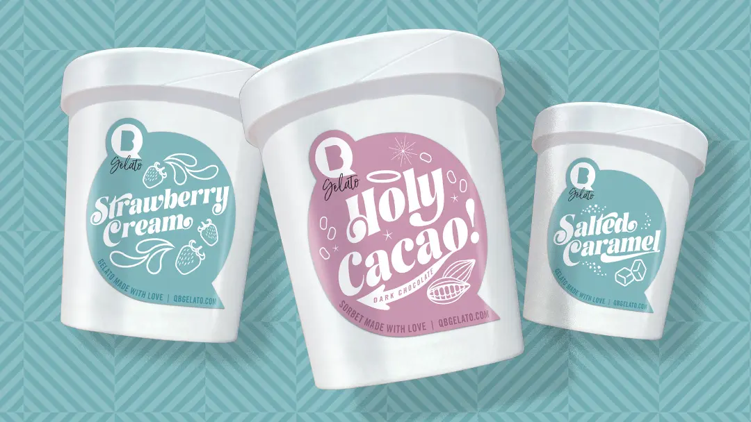
As the design system was being established, the labels and packaging were updated. Common flavours were labelled with unique pint designs to make them enticing and legible. Containers were switched up from craft paper to white paper to make the labels pop.
Baked goods, bread and desserts were also given an update so that they were easy to find in the freezer case and on the shelves. Illustrations and fun shapes were used to add more creativity and uniqueness to each label.
Signage, posters & Ads
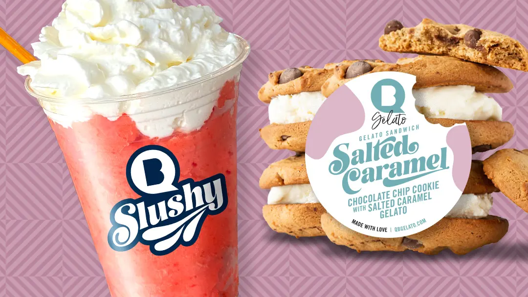
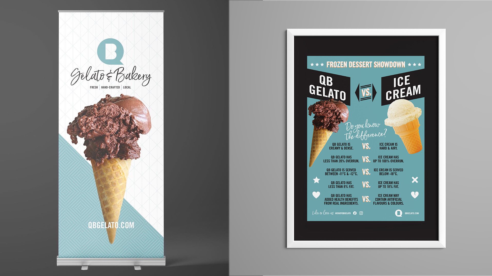
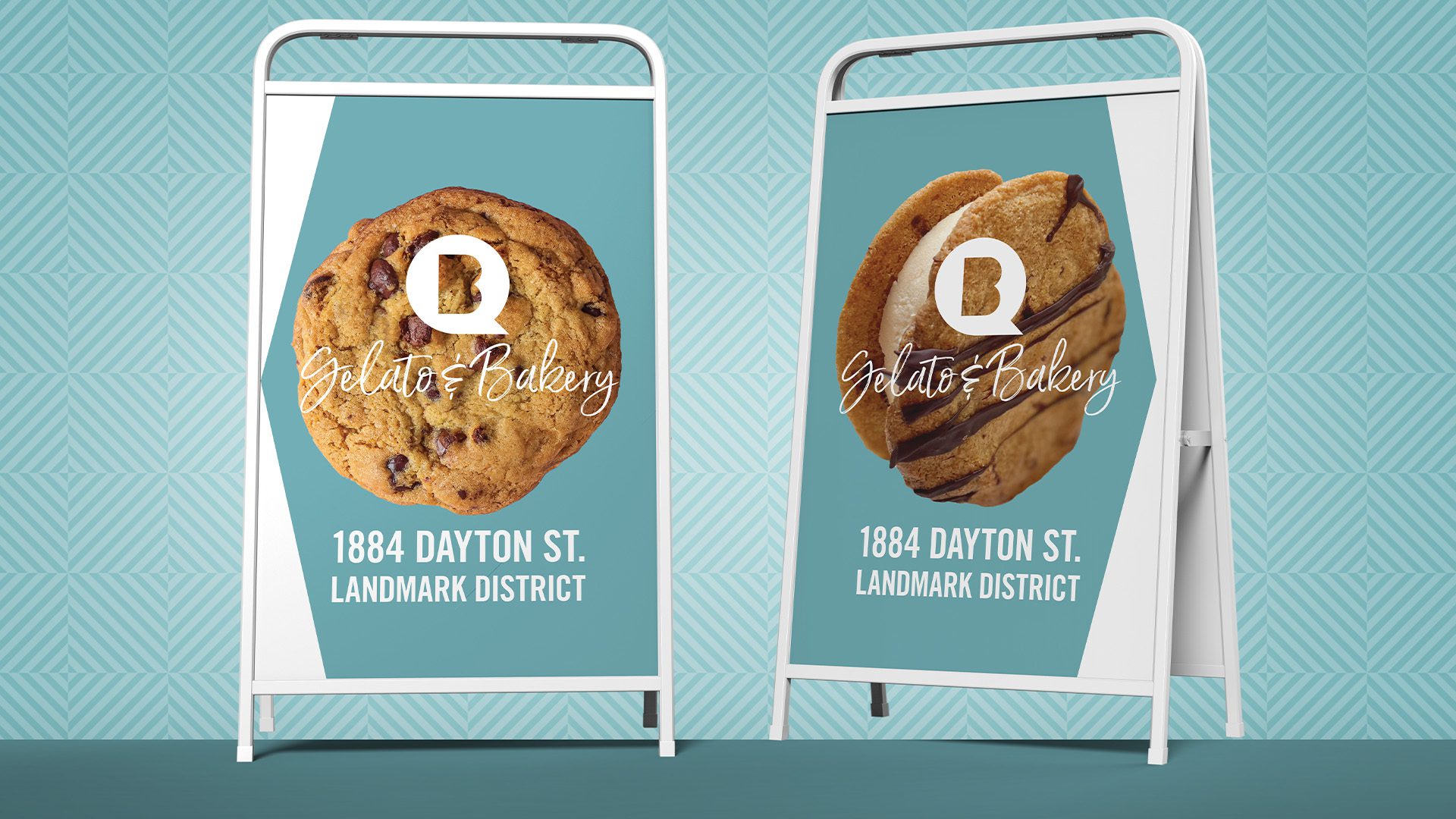
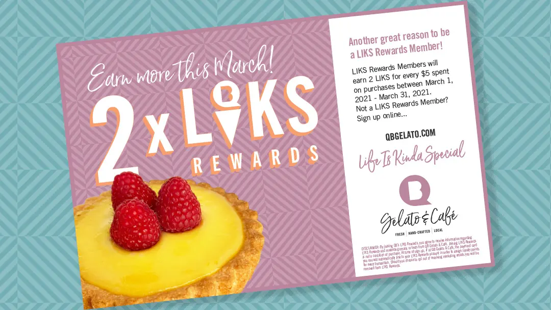
Photographs of the QB Gelato & Bakery products are the highlight of their Instagram page, drawing attention from fans and tantalizing visitors. It only seemed fitting to use products and ingredients as the heroes in posters, ads and signage whenever possible.
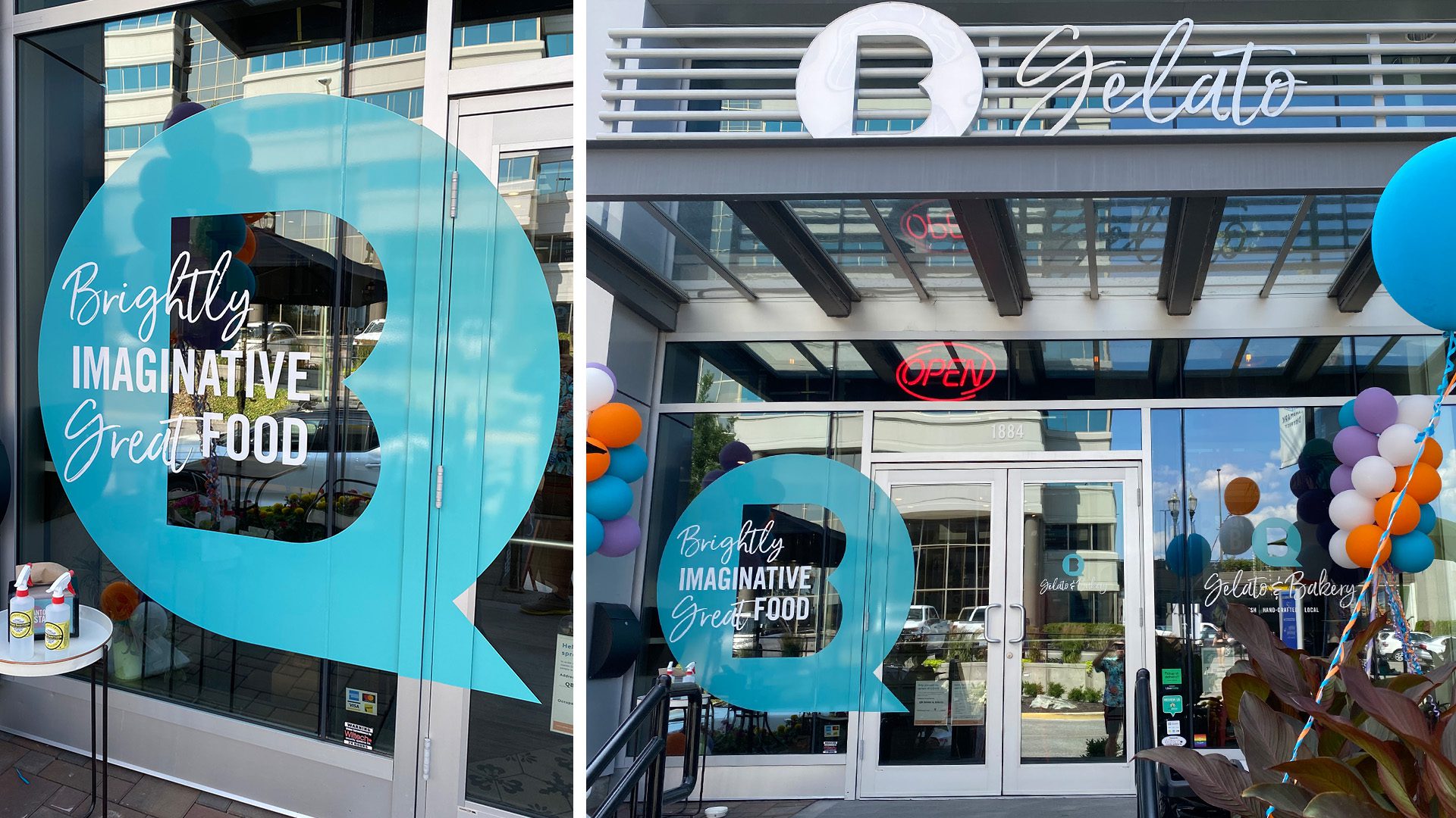
External vinyl was designed with visibility in mind breaking the frame in an unexpected way. Posters and banners were created with simplicity and large visuals in mind.
∧ CLICK ON THE IMAGES FOR EXAMPLES ∧

THE RESULT
The result is a cohesive and consistent collection of assets that embodies the fun factor of a bespoke gelato and bakery shop, and design systems that are easy to follow for both the patrons and proprietors.

