Note: Before you read any further, it is important to note that creating brand identities is about more than design basics. It is about creating a suitable logo (check out my process here), exploring the best ways to reach your audience, and creating a blueprint that allows you to meet expectations. This blog will help you be more discerning when it comes to using DIY design tools to communicate your brand effectively.
What We Often Forget About Fonts, Colours & Composition
Generative AI tools have made design, writing, and layout creation more accessible than ever. With just a few prompts, we can produce designs that meet our goals, often faster and more efficiently. For instance, I use Grammarly to streamline my writing and incorporate AI into my Adobe Creative Suite workflows for quicker image enhancement and graphic effects. While generative AI can feel like a win due to its speed and output quality, exceptional design still requires a solid grasp of design fundamentals. AI can’t generate original ideas or make creative decisions—that responsibility lies with the user, whose expertise ultimately adds value to AI-generated content.
Furthermore, AI-generated designs created using prompts referencing other people’s work blur the lines between plagiarism, copyright infringement and original work. If you have to refer to someone else’s work in a prompt, you aren’t being original, even if that prompt creates something the referenced artist would never create. But I digress; this post isn’t about generative AI but about creating brand identities with design basics.
Truly bold brands consider every design detail when creating new campaigns, ads, posts, print materials, and collateral. This means getting the design basics right with brand uniqueness in mind. Some design basics that must be considered are font selection, typography, colour choice, layout, and composition. The right choices can add legitimacy, uniqueness, and consistency to developing great brand identity design.
Fonts
Fonts are so well integrated into everyday communications that we only sometimes consider their value or importance. There are several ways to classify fonts, but for the purpose of this blog, I’m only concerned with how they are used in ad layout design as part of a brand identity, either in headers or body copy. The main job of a font used in body copy is to provide the means to communicate a message clearly. Most people don’t even think about fonts in body copy because a good font is like the wallflower at the party. They might be in every party picture but are rarely remembered–next to invisible.
Conversely, a font used in headers can be loud, fun and showy–the hit at any party. A font used in headers provides most of the personality of an ad or layout. However, not all fonts are created equal. There are bad fonts that should be avoided, as well as tried and true good fonts.
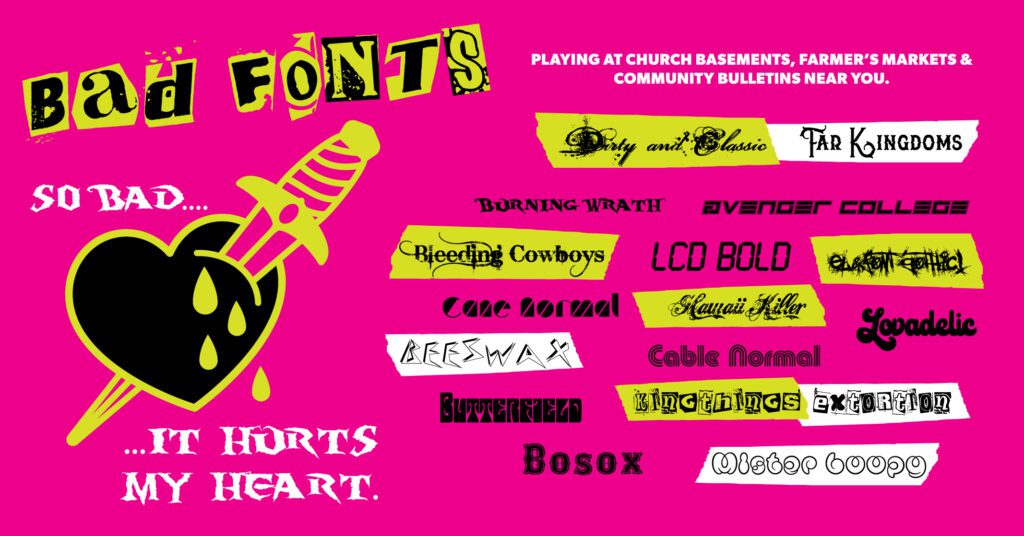
Bad Fonts
Bad fonts stick out like a sore thumb that gets reinjured repeatedly until it no longer resembles a thumb. Bad fonts are painful and uncomfortable to read. Some fonts become ubiquitous with amateur design because they look so unique from other fonts that they attract those who want to make something look “different.” We’ve all seen this in action, from the church emailer to the community bulletin board; bad fonts have run amuck. Everyone with a basic understanding of Microsoft Word becomes a designer in a pinch.
What makes a font bad is that it is used for the wrong purpose, is difficult to read, is a boring off-brand knockoff of another, or is too weird to be used for more than one word, let alone a phrase. Bad fonts should not be used for headers or body copy. Bad fonts are not to be confused with custom logotypes for logos. Some custom type can be quite unique and still make sense. Custom logotypes can be polarizing, especially when they are a departure from the norm. Still, a logo’s job is to identify a business first and communicate clearly second.
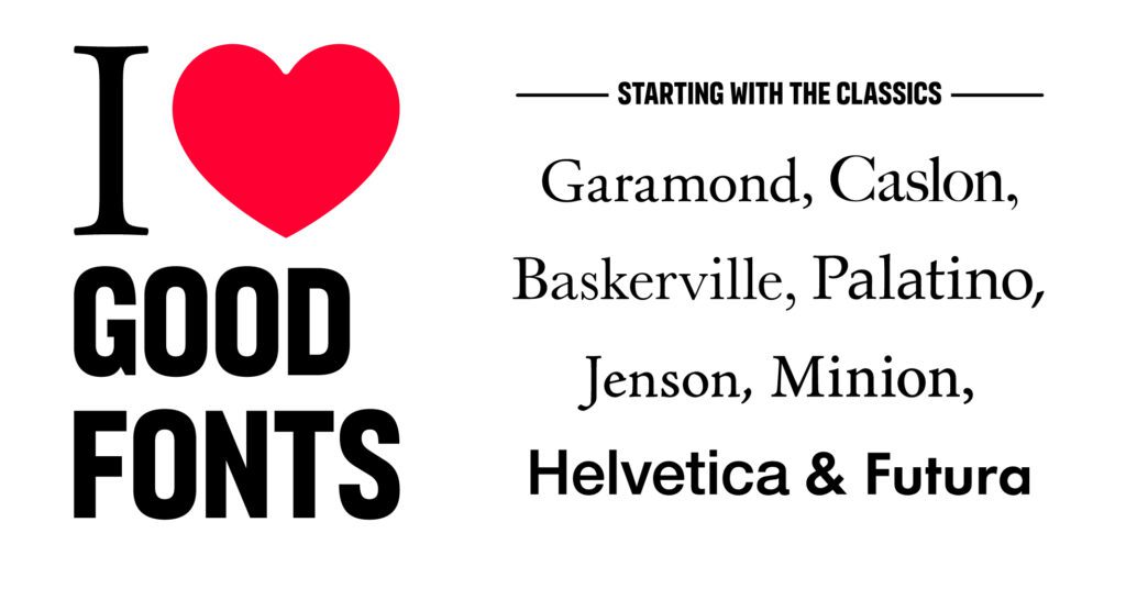
I love good fonts. Some classic fonts are Garamond, Caslon, Baskerville, Palatino, Jenson, Minion, Helvetica and Futura.
On the other hand, good fonts are legible, readable or both. They add to the emotion of a message; they can express joy, anger, and sadness or deliver information in a neutral voice. Good fonts can even evoke a sense of nostalgia with retro design sensibilities. When paired well, good fonts set the mood and personality of a message. It is realizing which ones are best to relay a message that takes a discerning eye and attention to detail. Studying the origins of specific fonts and their original uses can help find the right context for their use in design and branding. The same message told through different fonts can alter its meaning. Yes, some fonts can be a point of contention between graphic designers. I’m looking at you, Helvetica. However, some key attributes will always make a font liked. Comfortable x-height, well-proportioned ascenders and descenders, contrast, stroke weight, good spacing, legibility, readability and consistent texture are all objective attributes of a good font. Good fonts make large sections of text comfortable and enjoyable to read, which is why so many books have body copy set in serifed fonts like Garamond, Caslon, Baskerville, Palatino, Jenson and Minion. Sans serif fonts like Helvetica and Futura are good for both body copy and headers.
Colours
Colour psychology is a bit of nonsense peppered with nuggets of truth. First, I believe colour can influence our emotions and behaviour, but not to the extent that brand colour psychology advocates say it does. In fact, some evidence suggests that red can influence the ferocity with which someone will complete an action, and green can reduce one’s heart rate while exercising. These findings are not a coincidence; if we think critically, we can think of reasons why red is typically used as a colour for action and warning. If someone is furiously exerting themselves or screaming bloody murder, they may turn red, which is a signal that can evoke a fight or flight response in the observer.

Red is a colour of action, presumably because it is associated with danger – fire, anger and blood.
Furthermore, we associate red with fire and blood, which are both things to avoid. Green, on the other hand, has a calming effect likely due to its connection with nature. We might be hardwired as humans to see green as nourishing because greenery can offer sustenance and shelter and only appears where water is available. Plants also give off oxygen as a product of photosynthesis, which is necessary for humans to breathe.

Blue is associated with a deep, refreshing lake of clean water as much as it is with the big open sky or vast ocean, which is why it represents freedom, clarity, and dependability.
Most evidence proving the psychological and physiological power of colour stems from a colour’s natural origin. For example, blue is a deep, refreshing lake of clean water as much as it is the big open sky or vast ocean. Or even bright yellow is the energy and life-giving sun that bathes the world in optimistic warmth.
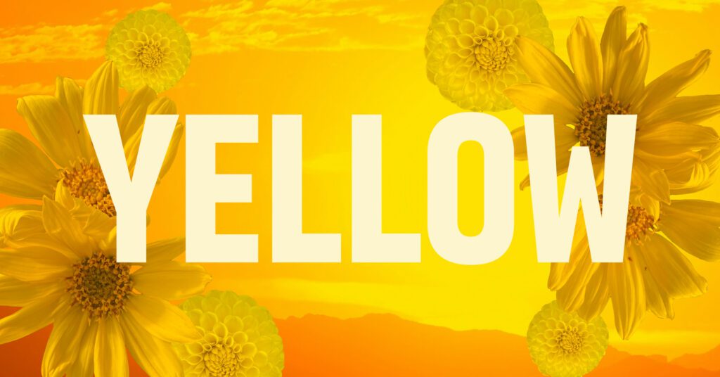
Yellow is associated with warm sunshine and optimism.
However, to say that a particular colour always represents a specific gender, industry, or concept would be an overstatement of the power of colour. The most significant influence of colour relates directly to an individual’s experiences with colour and their cultural influences. Culturally, we’ve come to expect some colours to represent specific things in the Western world. One only has to travel outside the Western world to experience new perspectives on colour. So, let’s debunk some of the colour psychology myths in seven points to understand how best to use colour for the right reasons in branding:
- Colours aren’t gendered. They’re colours. In some countries outside the Western world, pink is a masculine colour. Pink as a colour for girls is a social construct that companies have only reinforced to sell more stuff (sometimes at a higher cost).

Why isn’t construction equipment pink?
Feminist approaches to design would argue that using pink for things intended for girls is another way in which the world is reinforcing gender roles and stereotypes–why isn’t farm equipment pink?
- Colours aren’t industry-specific. Yes, blue can be associated with water, but if everyone uses blue in this way, we lose sight of why we develop unique brand colours in the first place. For example, Spotify chose green as its brand colour to stand out amongst other (predominantly blue and red) apps, focusing instead on the natural significance of green as a representation of growth, freshness, vitality, and renewal.
- Colours aren’t linked to a single concept. These correlations are cultural and can vary. For example, white is often associated with weddings, but it can also be associated with death, depending on which cultural lens you are using.
Similarly, purple can signify royalty but can also be associated with mourning. - Colour can influence our emotional state (but this is an overgeneralization).

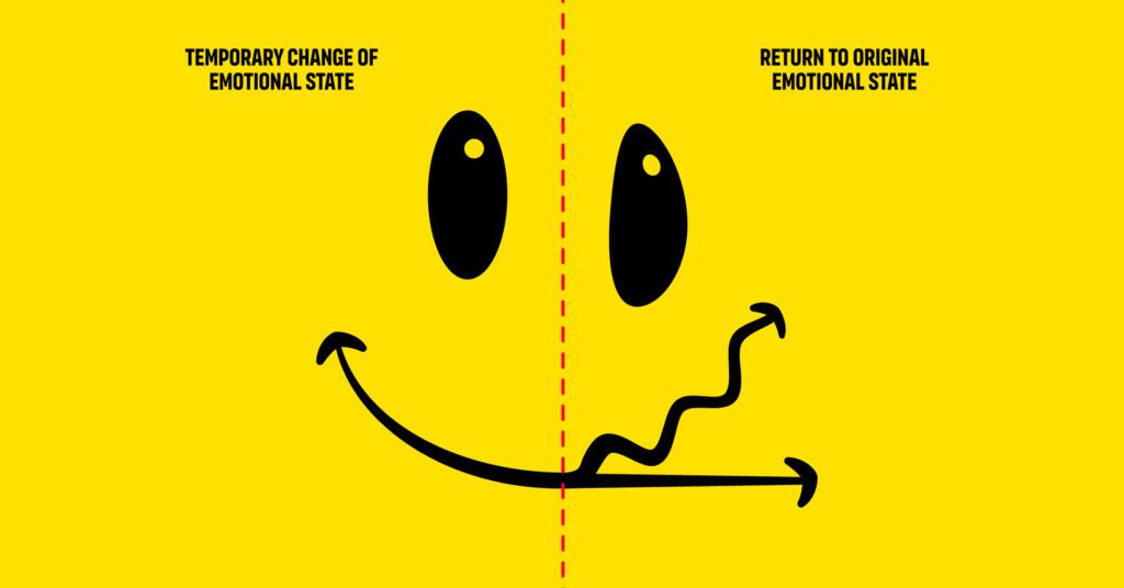
The temporary effects of colour on our mood are illustrated using a happy face that changes in the middle.
Not all tints and shades of a colour are equal in this respect. Darker “cool” colours can lower our moods, while brighter “warm” colours can elevate our mood and energize us. However, light yellow is more optimistic and uplifting than a dull shade of the same hue. There is also evidence that the effect colour has on our mood may only last for a while, and as we become more accustomed to the change, its mood-altering effect becomes less effective.
- Colours can take on new meaning. Politics, cultural shifts, and trends can also change the meaning of a colour. Think about global events and campaigns that have made an impact. For example, the two most prominent colours in politics in North America are red and blue, which hold different meanings depending on which country you refer to.
- Colours mean different things to different people based on their experiences. What purple means to individuals is a good example. Some people aware of the ancient history of the colour purple would understand why it has been associated with royalty and wealth. Some people aware of the history of International Women’s Day would know that purple is a colour associated with women’s equality.

Purple has a royal history as well as a herstory with feminism.
However, most people are not historians and only understand purple as just a secondary colour made by combining red and blue.
- No one sees colour in exactly the same way. We all experience colour differently based on our physiological differences. Whether or not we can see distinguishable differences between colours is in our DNA.

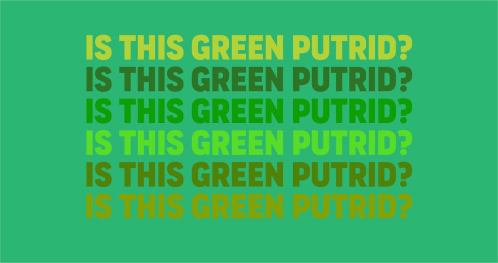
Varying hues and shades of green may look putrid to others.
Therefore, what I perceive as an attractive hue of green may be off-putting to others.
Following these points, it is evident that brand colours should be selected to make the most impact and not based on any predetermined set of stereotypes. Culture, heredity and our connection to the natural world dictate how we react to colour more than anything else.
Layouts & Compositions
We know through A/B testing that the right combination of fonts, colours, messaging and composition can make the difference in eliciting a higher response rate. Questions to consider in this process would be “Are you affecting the outcome by making visible changes?” or “Does the audience predetermine the outcome you’re changing things for?” or “Is it good design principles in practice that make the difference?”. I would argue that it is a combination of all three. We’ve become almost immune to ads, and seeing the same ad repeatedly becomes tired and easy to ignore. Serving a new ad with the same content remixed and redesigned can sometimes elicit a more significant number of responses. However, continually making edits in an attempt to reach ad perfection can become a costly, futile process. There are a considerable number of factors that cannot be controlled and that could affect the response behaviour of a person who is served an ad. For example, it could be the right moment in someone’s life when an ad served to them would elicit a response. Maybe their needs have changed, or their socioeconomic status has changed. Likewise, national, global and cultural factors could also make a difference. A mistake in A/B testing assumes that a prospective customer is not a free-thinking, three-dimensional person with a life outside the internet that affects their online decisions.
Generalization is the opposite of uniqueness; realizing that no brand is for everyone is the first step to creating better-performing ads. A more focused approach to ad design that caters to a specific audience will inevitably get a better response rate than anything generic. We see this often in how an audience reacts to social media posts. The posts that elicit the most responses from followers (while subject to platform algorithms) can be similarly replicated in terms of imagery, style and content to get similar results. Understanding your audience and their proclivity for specific content should always be top of mind for branding. When an audience feels like an ad is speaking to them directly using their language and aesthetic, they are likelier to trust the ad. Understanding a specific audience requires research and a keen eye for insights. However, it is always better to be a member of the audience you’re trying to attract than to make an inauthentic connection. Communicating with your audience should be easy, unlike writing a research paper or work of fiction. People can usually tell when a brand is serving them bullsh** or trying too hard.
Gleaning insights into what will resonate with your audience doesn’t always need to cost money or deviate from brand standards. Assumptions can be made based on how an audience reacts to social media posts. The posts that elicit the most responses from followers (while subject to platform algorithms) can be replicated in terms of imagery, style, and content to get similar results. Understanding your audience and their propensity for specific content should always be top of mind for branding. After all, emotional connections are at the core of all branding.
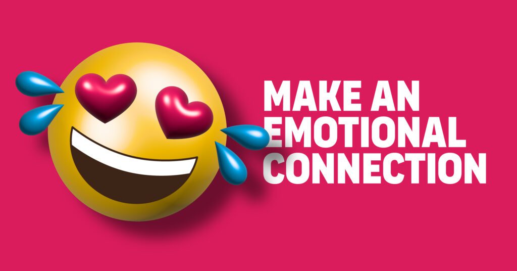
An emoji that incorporates multiple emotions illustrates an emotional connection
However, no ad can survive poor design choices. Good design principles based on thousands of years of evolution (and revolution) are proven to work in creating clear visual communications. Establishing composition blueprints through well-documented design systems in a cohesive brand identity can take the guesswork out of ad design. Assuring that the brand identity meets the needs of a specific audience and adheres to some design composition basics allows for more comprehensive A/B testing linked to campaigns rather than frivolous design edits that may damage the brand.
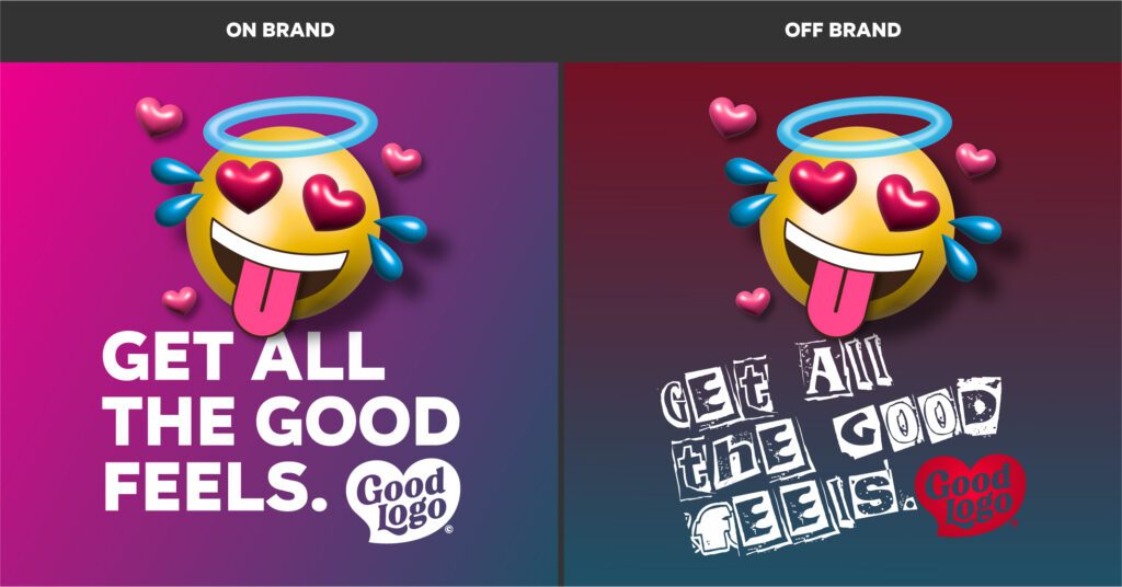
Ads illustrating the difference between on-brand and off-brand design
For example, changing a colour in an ad to something that is too close to a competitor’s signature colour may create brand confusion, which could lead to further issues. This can be seen often enough when a similar product appears on multiple sites.
In branding, design systems are created in order to replicate ads, web pages, print materials, videos and social media posts with fidelity to create brand consistency and take control of the brand narrative. While there are empirically well-established design principles and rules, it is how those rules are interpreted that makes a design system unique. A combination of principles of design is present in all good design. The most common design principles are Emphasis, Balance and Alignment, Contrast, Repetition, Proportion, Movement and White Space. Design principles create interest, emphasis and unity in composition, creating clarity in communication. However, breaking design rules effectively according to a defined brand identity can make for bolder branding.
The first key to great layout design and composition is understanding type hierarchy. Type hierarchy is a way of structuring text to guide the viewer and make content more readable. Good type hierarchy for ads combines three main type components: the header, subheader, and body copy. A header is a short statement used to attract a viewer’s attention. Subheaders qualify or elaborate on the header statement, and the body copy is a few phrases to clarify the header or subheader further.
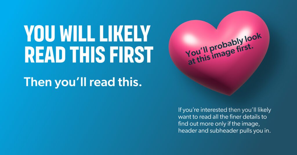
Image illustrating the effect of basic type hierarchy in guiding the viewer
With ad copy, the rule is to keep things as simple as possible, using available space without overcrowding. In fact, most ads shouldn’t depend on body copy; as David Ogilvy once said, “On average, five times as many people read the headline as read the body copy. When you have written your headline, you have spent eighty cents out of your dollar.”
The second key to good composition and layout design is good imagery. Sharp, vibrant, expressive imagery makes a massive difference in designing effective ads. The images of glossy high-end magazines still turn heads and start conversations. However, if the image of a product looks fake, the scene looks cheap, or the subject material is mundane, there’s no point in posting the ad. Photoshop and generative AI can only do so much. Ensure the image size is at least the same as the ad size and the resolution is slightly higher than required, or you could risk having the image appear pixelated. HDR photography pushes the boundaries of what seems realistic but can add a great deal of drama to an ad. And don’t forget to think about how the image will work with the copy. Typography can be as interesting as the imagery and should enhance the story you are trying to tell with an image, making the ad more effective. If you don’t have great imagery, telling your ad story through type can be an effective alternative.
The third key to good composition and layout design is allowing all components room to breathe. Nothing is more uncomfortable to look at than content that looks like it is about to burst out of its seams. The challenge is getting a message across using limited space and time. Simple imagery and text are most effective on billboards and online ads. By providing everything with its own space, you can guide the viewer to the most critical pieces of information within your composition, the product image and contact info (and/or call to action).
Putting it all together: How fonts, colours and composition work together to enhance a brand
Creating a brand involves a process of drawing insights from past experiences, taking risks, catering to the desires of a prospective audience, and following good design principles. To establish a brand that stands out, it is necessary to take some risks, which requires evaluating competitor brands and figuring out how to be different in a unique way. However, doing this without alienating potential customers is a delicate balancing act that requires big-picture thinking to pull together the correct design elements and connect the brand to its audience through unique insights and authentic storytelling.
The best approach to creating a memorable brand identity is to build upon the truth with the same visual excitement and passion entrepreneurs have for their business ideas. Knowing a bit about the expressiveness and intention of fonts and colours, as well as the rules of composition, aids in creating the blueprint for a truly effective brand identity.
Start with a key message or tagline and write it out in a font with personality, but make sure it is still readable and legible at ~6 pt. Choosing from the thousands of fonts out there can be overwhelming, so start with the classics and then work on finding fonts with similar qualities. Avoid novelty and free fonts; chances are they are free for a reason. Once you feel you have the right font, you can start to think about colours and imagery.
Selecting the right brand colours and imagery can be as simple as deliberately trying to be different from competitors. Some excellent examples are Liquid Death, LUSH and Old Spice. Just thinking of these products evokes images from their marketing, products and packaging designs. It could also be argued that bold and bright are better for brand colours as they tap into our emotional connection to colour more clearly than dull and greyish hues. Ensuring high contrast between the subject matter and the messaging is essential when working with colours and imagery. However, placing text onto an attractive, colourful background will only be as effective as how they are put together in a composition.
Creating interest in a composition can be done by playing with the sizing and positioning of elements. Headers always need to be at a noticeable and readable size, but where they are positioned can also add interest. But where should the important elements on a blank canvas go in order to make them stand out? The most straightforward answer is to use the rule of thirds. You can effectively find four points of interest in a composition by dividing a space into nine equal blocks. The corner points in the middle where these blocks meet are closest to the golden section for that composition. So long as the most important subject matter or messaging crosses one of these points, the viewer’s eyes will likely pick up on it faster. Placing essential elements on these points also removes the common desire to make everything symmetrically balanced, which can be lazy, predictable and boring.
Lastly, knowing when and how to break the rules can make a composition stand out from the crowd. Text doesn’t always have to be horizontal, and it doesn’t need to sit within the margins. Imagery can be expanded beyond the frame, creating a dramatic cut.
Conclusion
Fonts, colours, and composition are the fundamental building blocks of a brand’s visual identity. Ensuring each building block is considered for its uniqueness and ability to communicate will strengthen a brand identity. Consistently applying fonts, colours and composition techniques in brand identity design adds to the legacy of a brand story and enhances legitimacy.


