Why You Need the Right Logo for Your Business
Creating the right logo for your business is a creative exercise that requires research, patience and a deep understanding of your brand message. Knowing what you wish to convey in your logo is the first step. You can then focus your narrative and clearly communicate your expertise. As well as a key identifier, your logo says, “I know what I am doing.”
Avoiding Logo Clichés
“All I need is a logo!”, Maybe you’ve said it, or you’ve even thought it. “After all, once I have a logo for my business, I have something I can put on my website, business cards, packaging, signage, social media pages and letterhead. Once I have a logo, I can brand everything easily.” Unfortunately, this is a common misconception about the role and use of a logo often made when starting a business brand.
A decent logo can say “I’m doing things well”. A great logo will say “I know what I’m doing and I’m doing it right!”
Nothing says “I DO NOT know what I am doing” more than incorporating some tired cliché into a logo. We’ve all seen them. The fingernail half-moons, planets, rocket ships, swooshes, houses, trees, leaves, acronyms in boxes, checkmarks, stylized swoosh people and a tiring long list of things that have been exhaustively done already. Using any design cliché also risks appearing as though you are trying to copy someone. You should avoid copying to capitalize on others’ success because it can become a copyright infringement nightmare. It is best to avoid cliché altogether and create your own logo following a few unique identifier tips.
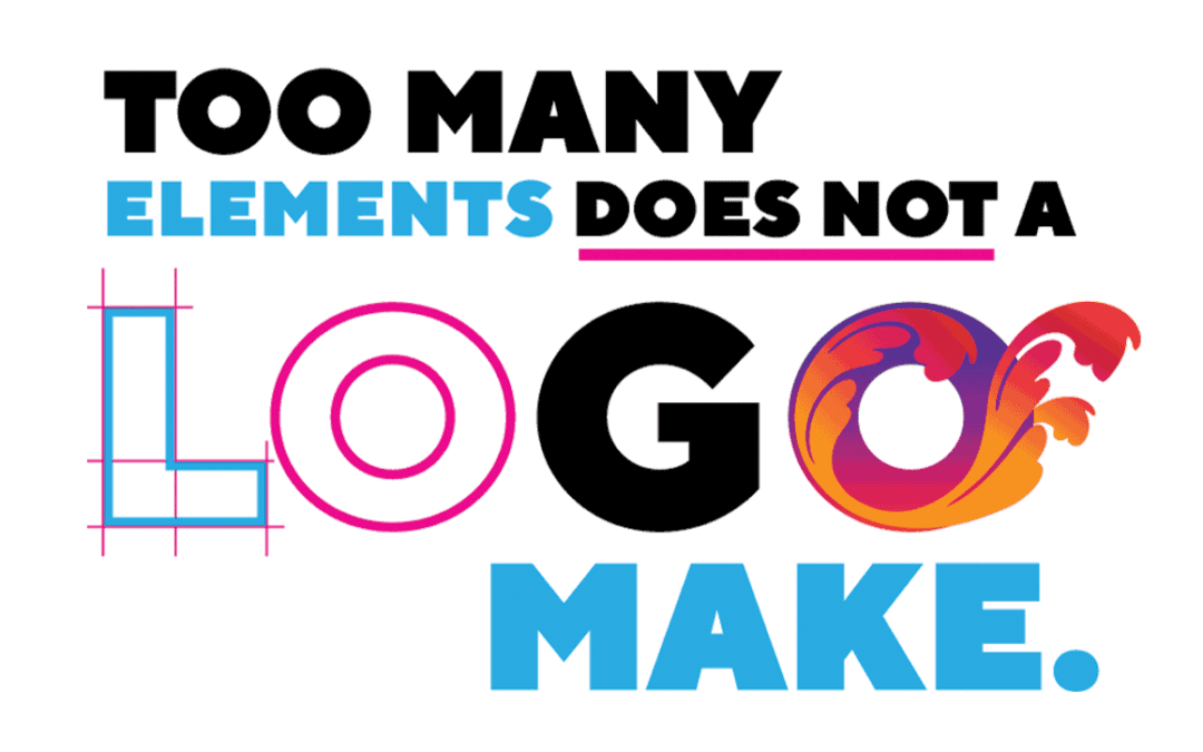
“Too many elements does not a logo make” should be a mantra running through your head when designing your own logo.
Real-World or Abstract Icons in Logos
Here’s something you might not have been told before, but I firmly believe creativity is something that CAN BE learned and developed. Thinking creatively is key to portraying the unique selling features of your business. So try to use some creative thinking exercises. Forego exhaustively trying to make one thing “happen,” like perfecting that realistic representation of what your business does into icon form and exploring your options. Symbols and shapes don’t necessarily need to be obvious representations of their real-world counterparts. They can even be abstract so long as they don’t detract from the overall purpose of the logo. However, if you decide to go with a logo that includes a symbol or shape icon that looks like a real-world object, try to make it your own stylistically. Visual double entendres, ambigrams, abstract designs and well-executed letter marks can make your logo something special.
Looking at several logos that use these techniques can inspire you. For example, The Guild of Food Writers, Spartan Golf Club, MyFonts and The Pittsburg Zoo use visual double entendres. Nine Inch Nails, Abba, Aerosmith and New Man Clothing use ambigrams. Mitsubishi, Nike, BHP Billiton, Chase Bank, MasterCard and Sony Vaio, are clever abstractions. The logos for Chanel, Toyota, Gucci, Hewlett Packard, IBM and CNN make good use of unique letter marks.
But perhaps you don’t even need an icon. Keeping in mind that a logo doesn’t necessarily have to have an icon opens up more design options in terms of fun typography for a wordmark. Look at Disney, Sony, Visa, Canon, Coca-Cola, Dell, Facebook, Budweiser, Ray-Ban and Fed Ex, for example. Each word mark is instantly recognizable and uses unique fonts, simple letterform adjustments and/or custom type design in a way that makes sense for their company. Another takeaway from studying logos of big-name brands is their simplicity. “Too many elements does not a logo make” should be a mantra running through your head when designing your own logo.
Clichés and Copyright Infringement
Knowing what you are doing requires that you do your research well. It’s not enough to avoid the design clichés and try to make something original. You should look at competitors’ logos and search for things similar to what you are proposing to design. If your proposed logo looks similar to something already created, you will need to explore other options. It’s not a bad idea to have people you trust look over your logo to ensure it doesn’t look like something they’ve seen before. It also helps to see if it looks like anything that could be mistaken for something else too. For example, the new Meta logo makes use of an infinity symbol which has been commonly used in many logos before it.
This doesn’t mean you couldn’t emulate a particular style for effectively creating, for example, a retro-style logo. It does mean that you’ve taken the time to make sure you haven’t created something that has already been created. The important thing is that your logo makes sense for your business and is as original as possible. If you don’t have an original logo, the same will be assumed of your business.
Following these few tips can help you on your way to creating the right logo for your business. A decent logo can say, “I’m doing things well.” A great logo will say, “I know what I’m doing, and I’m doing it right!”.
If you’ve enjoyed this, you will likely enjoy the next blog. What does your logo say about you? Insight THREE: My logo says, “I communicate well.” Check out previous articles in this series, likeWhat does your logo say about you? Insight ONE: My logo says, “I am deliberate and purposeful.”
Let’s chat about logos! Send me an email or visit cyanbolddesign.com to learn more about my work.
