Why Talk About the Categories of Logos?
I love to design logos. As a graphic designer, nothing is more satisfying than learning so much about a client’s business that you’re able to create a trademark that represents it clearly. And when a client is excited to use their logo on every facet of their business, you know you’ve done your job well. Delivering the right logo for every situation takes knowledge and skill. Knowing the categories of logos and their applications is a key part of the creative process in logo design.
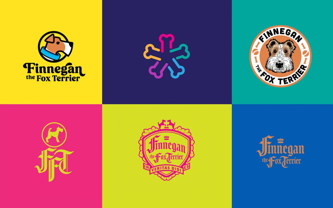
Everyone has their own ideas surrounding what a logo is and what it should be. But, few people know about the different categories of logos and how best to apply them. In this post, I explore the categories of logos. I also discuss a few new trends in logo design and what they entail. For my examples, I will use graphics of my dog-nephew, Finnegan, to illustrate the differences between the types and categories of logos. Isn’t he cute?!
First, What Is a Logo?
A logo (or logotype) is simply a graphic mark that identifies a company’s products or services to the public. It is the trademark under which a company does business. A good logo is unique, concise, memorable, and functional. There are many ways to categorize logos, but for this blog, I will attempt to break logos down into two main categories with distinctive subcategories.
It is also important to note that a logo represents a brand but is not the brand itself. If you compare a brand to a country, the logo is its flag. But a brand is much more than the sum of its tangible and intangible parts. And that is a topic for another blog post.
Two Basic Categories of Logos
A logo can fall into one of two categories by its primary elements: typography-based and pictorial-based. A typography-based logo is any logo that relies on unique letterforms and words to create a unique identifier. A pictorial-based logo uses an illustration, symbol, or stylized picture as its uniquely defining feature. Pictorial-based logos may also include type, but typography-based logos do not include pictures.
Typography-based Logos
There are wordmarks and lettermarks. You can probably guess the major difference by the name, but let’s dig a little deeper.
Wordmarks
A wordmark is a logo that spells out the name of the company. They can be one word, a combination of words, and even made-up words. A wordmark looks simple at first glance. However, the design of a good wordmark is deliberate and considerate. What makes wordmarks logos is the distinct features of their structure. Features such as letterforms and font treatments help to make a wordmark unique. Furthermore, fonts and letterforms have perceived personalities that subconsciously affect the viewer. For example, due to font choice in a wordmark, the viewer may perceive a company to have any number of brand attributes such as modern, expensive, friendly and even trustworthy.
Lettermarks
A lettermark is a logo that uses an abbreviation or initials of the company name to create a unique identifier. Similar to a wordmark, you need to consider the qualities of letterforms and fonts when designing a lettermark. Good lettermarks are just as expressive as any wordmark. Monograms are lettermarks with highly-expressive attributes.
Pictorial-based Logos
Four subcategories of pictorial-based logos are mascot, symbolic, abstract, and emblem. It is important to note that pictorial-based logos are often inseparable from their names. We all wish we could be Nike or Apple; however, most businesses won’t reach the same level of recognizability from their logo without their names visually connected somehow.
Mascot Logos
A mascot logo uses a character or stylized depiction of a person as a defining element of the logo. You often think about their associated mascot when you think about Wendy’s, KFC, Pringles, Mailchimp, Green Giant, Mr. Clean, and multiple sports teams. They integrate well into a logo with text. However, when seen on their own, they are instantly recognizable as identifiers of their respective companies.
Symbolic Logos
A symbolic logo uses a simplified picture or symbol as the defining element of the logo. You can think of these as modern hieroglyphs. They are sometimes used in place of text to represent a company. However, the company usually needs to have a very established brand before this is recognized independently. Therefore, before you can recognize a symbolic logo on its own, you typically have to see it combined with its written name. Great symbolic logo examples include Apple, Dominoes, Twitter, Batman, Green Lantern, and Hootsuite. (Arguably, one of the best logos globally, Apple, is the best example of this. Apple has made its symbolic apple icon synonymous with its company name. As a result, they no longer have to spell out their name for their audience to know who they are.)
Abstract Logos
An abstract logo uses an abstract symbol or icon (that doesn’t necessarily have to represent anything in particular). The simpler the abstract symbol, the better it is for recognition. By making the abstract symbol a specific colour, you can create a distinct look and feel based on colour psychology. Big companies like Pepsi, Spotify, Nike, MasterCard, Adidas, CBC, and Mercedes use abstract logos to help define their brand.
Emblem Logos
An emblem logo combines text and imagery inside another structure like a badge or patch. These are in the pictorial-based category because emblems require shapes and symbols. They attempt to capture the company’s essence in a kind of coat of arms. These types of logos lend themselves nicely to patches, stickers, social media profiles, stamps etc. Universities and colleges use them to represent more than one side of their institutions in a concise logo. Think Starbucks, Warner Brothers, General Electric, UBC, and UPS, for example.
Are There Any Other Categories of Logos?
There are hybrids of each category of logo discussed in this blog. In addition, however, different categories attempt to explain the multi-faceted nature of logo design. These categories are unique in that they describe design systems rather than categories of logos. Furthermore, they are dynamic by nature, making them responsive, adaptive and variable.
Responsive Logos
You can’t discuss responsive logos without discussing responsive web design. When a website serves information to the screen of a handheld device, its content becomes more streamlined. Information and content on the website pare down to only necessary, easy-to-read chunks. Streamlining information in this way makes a responsive website more accessible to consumers across devices. This is the basis of responsive design–a design that changes for the size of the device. As a result, logos are viewed in smaller sizes as well. However, most logos are hard to read at small sizes, so responsive logos are helpful.
Responsive logos are a series of progressively simpler identifiers designed to be viewed at incrementally smaller sizes. They are the logo design answer to responsive web design. You create a responsive logo if you reduce a logo to its most basic elements in incremental steps. Joe Harrison illustrates this concept on the Responsive Logos website. However, responsive design works best with big brands because they have brand recognition beyond their name.
Adaptive/Variable Logos
Some logos are experiments in design. They may come in a few standard versions but can warp, mould, and crop to fit the format of the medium. Most of these are typography-based, and a surprising number of them are for art galleries. This avant-garde approach to logo construction makes an adaptive logo so experimental. An adaptive/variable logo can also be seen as a design system tailor-made for a tradename that creatively captures the entity’s personality.
A great example of a new variable logo and identity is that of Serif by Pentagram. To see this in action, check out the article on Creative Review.
Another great example by Pentagram is the Tribeca Festival identity refresh. Again, the dynamic way they’ve played with the existing logo and new typography creates a visual representation of a gathering of people coming together for a festival.
Another example of an adaptive/variable logo is the logo for the Reykjavík Art Museum by Karlssonwilker. The logo is in 3D as a representation of one museum in three different locations. A change of vantage point provides the name of a site of the art museum.
Final Thoughts
Knowing a bit about each logo category and subcategory can help develop logo options. While categorizing logos may be slightly subjective, it helps to know these categories before starting a logo design. Specific categories of logos communicate different attributes to an audience. For example, mascot logos make brands seem more playful, approachable and personable. On the other hand, mascot logos are less serious. You likely would not want to use a mascot logo for a bank or traditional institution built on professionalism and trust.
For the example of Finnegan the Fox Terrier, I think the mascot logo works best. It is a close representation of Finnegan and makes a personal connection. However, it is fun to break the rules and play with alternative design choices. For example, Finnegan the Fox Terrier could be represented less obviously with an abstract logo. The most critical part of logo design is matching the logo to the brand.
I personally love to create symbolic and abstract logos. The potential for using the icons in future branding endeavours is an added perk. Their uniqueness also adds value to a brand. It is easy to see why these subcategories of logos are so popular.
Matching the category of the logo to the brand is a topic for another blog article. Be sure to check back for updates.
For insights on the importance of logo design as it pertains to your business, be sure to check out my blog series What Does Your Logo Say About You?
Do have a business in need of a new logo? Connect with me by email for a consultation, or visit cyanbolddesing.com to check out my work.
